Android Kotlin Fundamentals Course 코드랩 하면서 노트. Android Kotlin Fundamentals: ViewModel 부터.

Useful Shortcuts

  • Override Methods: Choose Code > Override Methods, or CTRL+o
  • Comment: Choose Code > Comment with Line Comment or CTRL+/ (Command+/ on a Mac)

App architecture

Follow Android app architecture guidlines and Android Architecture Components. Similarly MVVM.

  • UI-controller: Activity or Fragment. Display data and capture OS/user events.
  • ViewModel: Hold all of the data needed for the UI and prepare it for display
  • ViewModelFactory: instantiates ViewModel

ViewModel

ViewModel class to store and manage UI-releated data in a lifecycle-conscious way. (safe for device-configuration changes via ViewModelFactory)

Add dependencies

// build.gradle (app-level)
dependencies {
  // ...

  //ViewModel
  implementation 'androidx.lifecycle:lifecycle-viewmodel-ktx:2.2.0'
}

Then, sync.

Create GameViewModel in screens/game/ folder.

class GameViewModel : ViewModel() {
  init {
    Log.i("GameViewModel", "GameViewModel created!")
  }

  override fun onCleared() {
    super.onCleared()
    Log.i("GameViewModel", "GameViewModel destoryed!")
  }
}

Associate GameViewModel with the game fragment.

// in GameFragment.kt
private lateinit var viewModel: GameViewModel

ViewModelProvider create the ViewModel instance so that the view model survives during the configuration changes. The provider manages the lifecycle of the view model until the UI is destroyed.

Initialize the viewModel using ViewModelProvider.get().

Log.i("GameFragment", "Called ViewModelProvider.get")
viewModel = ViewModelProvider(this).get(GameViewModel::class.java)

Remember,

  • Fragment: Display fragment, capture user events, do not survive config changes
  • ViewModel: Hold data for fragment, should never contain references to any fragments/activities

Move all states from Fragment to ViewModel.

Pass data to next fragments.

private fun gameFinished() {
  Toast.makeText(activity, "Game has just finished", Toast.LENGTH_SHORT).show()
  val action = GameFragmentDirections.actionGameToScore()
  action.score = viewModel.score
  NavHostFragment.findNavController(this).navigate(action)
}

However, ViewModel is destoryed during the transition. It needs ViewModelFactory for that.

ViewModelFactory

Create ScoreViewModel.

class ScoreViewModel(finalScore: Int): ViewModel() {
  var score = finalScore
  init {
    Log.i("ScoreViewModel", "Final score is $finalScore")
  }
}

Create ScoreViewFactory and override the create() method.

class ScoreViewModelFactory(private val finalScore: Int) : ViewModelProvider.Factory {
    override fun <T : ViewModel?> create(modelClass: Class<T>): T {
        if (modelClass.isAssignableFrom(ScoreViewModel::class.java)) {
            return ScoreViewModel(finalScore) as T
        }
        throw IllegalArgumentException("Unknown viewModel class")
    }
}

Add members in the fragment.

private lateinit var viewModel: ScoreViewModel
private lateinit var viewModelFactory: ScoreViewModelFactory

Initialize viewModel using the factory from onCreateView().

// in `onCreateView()`
// init factory with given arguments via navigation
viewModelFactory = ScoreViewModelFactory(ScoreFragmentArgs.fromBundle(requireArguments()).score)
// get view model from the provider via factory
viewModel = ViewModelProvider(this, viewModelFactory)
  .get(ScoreViewModel::class.java)

Then, the fragment uses data from the viewModel.

binding.scoreText.text = viewModel.score.toString()

Parameterized constructor of viewModel is useful when the data should be right during initialization.

LiveData

Data objects that notify views when the underlying database changes. Set up "observers" to the activities or fragments. Also it is lifecycle-aware and watch only active ones.

  • LiveData is observable, which means that an observer is notified when the data held by the LiveData object changes.
  • LiveData holds data; LiveData is a wrapper that can be used with any data
  • LiveData is lifecycle-ware. For this, the observer is associated with LifecycleOwner so that is working with active state only.
// GameViewModel.kt
val word = MutableLiveData<String>()
val score = MutableLiveData<Int>()

init {
  word.value = ""
  score.value = 0
}

Update object references. minus() and plus() are null-safety manipulation.

// score--
score.value = (score.value)?.minus(1)

// score++
score.value = (score.value)?.plus(1)

// word = wordList.removeAt(0)
word.value = wordList.removeAt(0)

References in the fragment needs to update too.

// binding.wordText.text = viewModel.word
binding.wordText.text = viewModel.word.value

// action.score = viewModel.score
action.score = viewModel.score.value?:0

Attach observers to the LiveData objects

Note: fragment's lifecycle and fragment view's lifecycle is a bit different. Always set the observers in onCreateView() and pass viewLifecycleOwner to observers.

// in onCreateView()

viewModel.score.observe(viewLifecycleOwner, Observer { newScore ->
  binding.scoreText.text = newScore.toString()
})
viewModel.word.observe(viewLifecycleOwner, Observer { newWord ->
  binding.wordText.text = newWord.toString()
})

Then, remove updateWordText() and updateScoreText().

Use MutableLiveData for encapsulation

Using backing property, ViewModel uses MutableLiveData internally and exposes LiveData to public access.

// from
val score = MutableLiveData<Int>()

// to
private val _score = MutableLiveData<Int>()
val score: LiveData<Int>
  get() = _score

Check Getters and Setters in Kotlin.

Internally, viewModel should use _score now.

// in ViewModel
_score.value = (score.value)?.minus(1)

// for reading
binding.scoreText.text = score.value.toString()

Example: game-finish event

private val _eventGameFinish = MutableLiveData<Boolean>()
val eventGameFinish: LiveData<Boolean>
  get() = _eventGameFinish

fun nextWord() {
  if (wordList.isNotEmpty()) {
    //Select and remove a word from the list
    _word.value = wordList.removeAt(0)
  } else {
    onGameFinish()
  }
}

fun onGameFinish() {
  _eventGameFinish.value = true
}

fun onGameFinishComplete() {
  _eventGameFinish.value = false
}

in the fragment,

// onCreateView()
viewModel.eventGameFinish.observe(viewLifecycleOwner, Observer<Boolean> { hasFinished ->
  if (hasFinished) gameFinished()
})

private fun gameFinished() {
  // ...
  viewModel.onGameFinishComplete()
}

Example: transition event

// in ViewModel
private val _eventPlayAgain = MutableLiveData<Boolean>()
val eventPlayAgain: LiveData<Boolean>
    get() = _eventPlayAgain

fun onPlayAgain() {
    _eventPlayAgain.value = true
}
fun onPlayAgainComplete() {
    _eventPlayAgain.value = false
}
// onCreateView() in Fragment
binding.playAgainButton.setOnClickListener { viewModel.onPlayAgain() }

viewModel.eventPlayAgain.observe(viewLifecycleOwner, Observer<Boolean> { playAgain ->
  if (playAgain) {
    findNavController().navigate(ScoreFragmentDirections.actionRestart())
    viewModel.onPlayAgainComplete()
  }
})

Data binding with ViewModel and LiveData

Current:

Views        <- UI Controller          <- ViewModel
(XML layout)    (activity/fragment        (LiveData)
                 with click listeners)

ViewModel passed into the data binding:

Views        <- ViewModel
(XML layout)    (LiveData)

Data binding with ViewModel

Add ViewModel into fragment xml file.

<layout ...>
  <data>
    <variable
      name="gameViewModel"
      type="com.example.android.guesstheword.screens.game.GameViewModel" />
  </data>

  <androidx.constraintlayout...>

Add data binding at onCreateView() in the Fragment.

binding.gameViewModel = viewModel

Use listener bindings for event handling via lamda expression.

<Button
   android:id="@+id/skip_button"
   ...
   android:onClick="@{() -> gameViewModel.onSkip()}"
   ... />

Then, remove all onClickListener() in the acitivities and fragments.

Note: data-binding error messages are quite hard to understand. Read the error and check the spell carefully.

Data binding with LiveData

<TextView
  android:id="@+id/word_text"
  ...
  android:text="@{gameViewModel.word}"
  ... />
<TextView
  android:id="@+id/score_text"
  ...
  android:text="@{String.valueOf(scoreViewModel.score)}"
  ... />
binding.gameViewModel = viewModel
binding.lifecycleOwner = viewLifecycleOwner

Then, remove all observe() for updating the content.

Formatting

in string.xml:

<string name="quote_format">\"%s\"</string>
<string name="score_format">Current Score: %d</string>

in the fragment xml file,

<TextView
  android:id="@+id/word_text"
  ...
  android:text="@{@string/quote_format(gameViewModel.word)}"
  ... />

Check Layouts and binding expressions.

As a result, each fragments only observes the navigation related LiveData.

Transformations for LiveData

Transformations manipulates the data in LiveData for sanitizing, deducting, subsetting, etc. e.g. Transformations.map, Transformations.switchMap.

Add a timer

// in ViewModel
companion object {
  private const val DONE = 0L
  private const val ONE_SECOND = 1000L
  private const val COUNTDOWN_TIME = 60000L
}

private val _currentTime = MutableLiveData<Long>()
val currentTime: LiveData<Long>
  get() = _currentTime

private val timer: CountDownTimer

init {
  timer = object : CountDownTimer(COUNTDOWN_TIME, ONE_SECOND) {
    override fun onTick(millisUntilFinished: Long) {
      _currentTime.value = millisUntilFinished / ONE_SECOND
    }
    override fun onFinish() {
      _currentTime.value = DONE
      onGameFinish()
    }
  }

  timer.start()
}

override fun onCleared() {
  super.onCleared()
  timer.cancel()
}

Now, the time should display "MM:SS" format rather than just a number. DataUtils.formatElaspedTime() is utility method takes a long number of milliseconds and format the number to the time format.

// in ViewModel
val currentTimeString = Transformations.map(currentTime) { time ->
  DataUtils.formatElaspedTime(time)
}
// it's like a computed property in Swift and/or Vue.js.

Then, update fragment xml file.

<TextView
  android:id="@+id/timer_text"
  ...
  android:text="@{gameViewModel.currentTimeString}"
  ... />

다음 챕터: Android Kotlin Fundamentals: 06.1 Create a Room database
Android Kotlin Fundamentals Course 코드랩 하면서 노트. Android Kotlin Fundamentals: 03.3 Start an external Activity 부터.

Useful Shortcuts

  • Override Methods: Choose Code > Override Methods, or CTRL+o
  • Comment: Choose Code > Comment with Line Comment or CTRL+/ (Command+/ on a Mac)

Safe Args

Safe Args generates NavDirection classes to prevent bugs during passing parameters between Fragments.

To pass the parameters between Fragments, Bundle is one of the way to handle the data (key-value store). It does not guarantee type-safety such as type mismatch error, missing key errors.

Dependency

// project Gradle file
dependencies {
  //...
  classpath "androidx.navigation:navigation-safe-args-gradle-plugin:$navigationVersion"
}
// app Gradle file
apply plugin: 'androidx.navigation.safeargs'

Then, sync and rebuild the project. The plugin will generate NavDirection class, and it's in the generatedJava folder.

Use typed action ID

Use the type-safe name rather than R.id.<ID> action ID.

view.findNavController()
        .navigate(GameFragmentDirections.actionGameFragmentToGameWonFragment())

Add and pass arguments

Open navigation.xml, select the fragment, then add argument from the Attributes tab.

Then, the build will fail because of the new arguments. Update the exisiting code with the parameters. The class will be <name>FragmentDirections.

view.findNavController()
    .navigate(GameFragmentDirections
      .actionGameFragmentToGameWonFragment(numQuestions, questionIndex))

In the next Fragment, it is available to access through <name>FragmentArgs.

val args = GameWonFragmentArgs.fromBundle(requireArguments())
Toast.makeText(context, "NumCorrect: ${args.numCorrect}, NumQuestions: ${args.numQuestions}", Toast.LENGTH_LONG).show()

Implicit intents

Android allows you tu use intents to navigate to activities that other apps provide. e.g. share the game result to share menu. Intent is a simple message object taht is used to communicate between Android components. Implicit intent doesn't require which app or activity will handle the task.

// in onCreateView
setHasOptionsMenu(true)

// Creating our Share Intent
private fun getShareIntent() : Intent {
  val args = GameWonFragmentArgs.fromBundle(requireArguments())
  val shareIntent = Intent(Intent.ACTION_SEND)
  shareIntent.setType("text/plain")
    .putExtra(Intent.EXTRA_TEXT, getString(R.string.share_success_text, args.numCorrect, args.numQuestions))
  return shareIntent
}

Intent action would be Intent.ACTION_SEND, etc. Check the example.

// Starting an Activity with our new Intent
private fun shareSuccess() {
  startActivity(getShareIntent())
}

// Showing the Share Menu Item Dynamically
override fun onCreateOptionsMenu(menu: Menu, inflater: MenuInflater) {
  super.onCreateOptionsMenu(menu, inflater)

  // Note: winner_menu.xml is already prepped in the example
  inflater.inflate(R.menu.winner_menu, menu)
  if(getShareIntent().resolveActivity(requireActivity().packageManager) == null){
    menu.findItem(R.id.share).isVisible = false
  }
}

Pass resolveActivity through packageManager so that find out which app is eligible to handle this intent. If there is no app related with this, the menu will be hidden.

// Sharing from the Menu
override fun onOptionsItemSelected(item: MenuItem): Boolean {
  when(item.itemId){
    R.id.share -> shareSuccess()
  }
  return super.onOptionsItemSelected(item)
}

Lifecycle

Check Understand the Activity Lifecycle.

Check the use cases.

The general pattern is that when you set up or start something in a callback, you stop or remove that thing in the corresponding callback. This way, you avoid having anything running when it's no longer needed.

Activity Lifecycle

         [Resumed]      }  }-- activity has focus
          |     |       }  }
    onResume   onPause  }  
          |     |       }
         [Started]      }-- activity is visible
          |     |
    onStart    onStop
    onRestart   |
          |     |
         [Created]
          |     |
    onCreate   onDestroy
          |     |
[Initialized] [Destroyed]

Fragment Lifecycle

         [Resumed]      }  }-- fragment has focus
          |     |       }  }
    onResume   onPause  }
          |     |       }
         [Started]      }-- fragment is visible
          |     |
      onStart  onStop
onViewCreated  onDestoryView
 onCreateView   |
          |     |
         [Created]
          |     |
    onCreate   onDestroy
    onAttach   onDetach
          |     |
[Initialized] [Destroyed]
  • onAttach(): Called when the fragment is associated with its owner activity.
  • onCreate(): Similarly to onCreate() for the activity, onCreate() for the fragment is called to do initial fragment creation (other than layout).
  • onCreateView(): Called to inflate the fragment's layout.
  • onViewCreated(): Called immediately after onCreateView() has returned, but before any saved state has been restored into the view.
  • onStart(): Called when the fragment becomes visible; parallel to the activity's onStart().
  • onResume(): Called when the fragment gains the user focus; parallel to the activity's onResume().

Check lifecycle using logging

Add log on onCreate() method in the MainActivity.

Log.i("MainActivity", "onCreate Called")
// i: info
// e: error
// w: warning

"MainActivity" tag helps to find the log in the Logcat.

Open Logcat pane in Android Studio and search I/MainActivity.

Create lifecycle methods

Use Override Methods menu, add onStart(). (CTRL+o)

override fun onStart() {
  super.onStart()

  Log.i("MainActivity", "onStart Called")
}

Check the log and test in vary (Press the Home button then back to the screen.)

Use Timber for logging

  • Generates log tag by class name
  • Show the log only in dev
  • integration with crash reporting libs

Add dependencies

Check latest version from the Timber project page.

// build.gradle (app level)
dependencies {
  // ...
  implementation 'com.jakewharton.timber:timber:4.7.1'
}

Then, sync it.

Initialize Timber

Create Application class for the logging library. Note: Do not put any activity code here unless the code is really needed.

package com.example.android.dessertclicker

import android.app.Application
import timber.log.Timber

class ClickerApplication : Application() {
  override fun onCreate() {
    super.onCreate()

    Timber.plant(Timber.DebugTree())
  }
}

Open AndroidManifest.xml and add Application name there to connect custom application class.

<application
  android:name=".ClickerApplication"
  ... />

Add Timber log in the code.

Timber.i("onCreate called")

Lifecycle library

  • Lifecycle owners: Activity and Fragment. Implement the LifecycleOwner interface
  • Lifecycle class: holds actual state of a lifecycle owner and triggers events
  • Lifecycle observers: observe the lifecycle state and perform tasks. Implement the LifecycleObserver interface
// change the class signature
class DessertTimer(lifecycle: Lifecycle) : LifecycleObserver {

// add init block
init {
  lifecycle.addObserver(this)
}

// Add annotation on `startTimer()` and `stopTimer()`
@OnLifecycleEvent(Lifecycle.Event.ON_START)
fun startTimer() {
  // ...
}

@OnLifecycleEvent(Lifecycle.Event.ON_STOP)
fun stopTimer() {
  // ...
}

Then, initialize the class with the lifecycle in activity.

dessertTimer = DessertTimer(this.lifecycle)

onSaveInstanceState()

Some app can be killed by Android during the background and respring it. Therefore the status need to be stored some places. It also needed to handle configuration change such as orientation changes of the device.

The bundle stores in RAM so keep the data small here(<100k) otherwise crash with TransactionTooLargeException.

Kill the app using adb.

adb shell am kill com.example.android.dessertclicker
                    [Resumed]
                     |     |
               onResume   onPause
                     |     |
                    [Started]
                     |     |
  onRestoreInstanceState  onStop
                 onStart  onSaveInstanceState
               onRestart   |
                     |     |
                    [Created]
                     |     |
               onCreate   onDestroy
                     |     |
           [Initialized] [Destroyed]
  • onSaveInstanceState(): Save any data that need if the app destoryed.
  • onRestoreInstanceState()
override fun onSaveInstanceState(outState: Bundle) {
  super.onSaveInstanceState(outState)

  Timber.i("onSaveInstanceState Called")
}

Add constants before the class definition.

const val KEY_REVENUE = "revenue_key"
const val KEY_DESSERT_SOLD = "dessert_sold_key"
const val KEY_TIMER_SECONDS = "timer_seconds_key"

Save the information into the bundle.

outState.putInt(KEY_REVENUE, revenue)
outState.putInt(KEY_DESSERT_SOLD, dessertsSold)
outState.putInt(KEY_TIMER_SECONDS, dessertTimer.secondsCount)

Restore the data from the onCreate().

Note: If the activity is being re-created, the onRestoreInstanceState() callback is called after onStart(), also with the bundle. Most of the time, you restore the activity state in onCreate(). But because onRestoreInstanceState() is called after onStart(), if you ever need to restore some state after onCreate() is called, you can use onRestoreInstanceState().

override fun onCreate(savedInstanceState: Bundle?) {
  super.onCreate(savedInstanceState)
  // ...
  if (savedInstanceState != null) {
    revenue = savedInstanceState.getInt(KEY_REVENUE, 0)
    dessertsSold = savedInstanceState.getInt(KEY_DESSERT_SOLD, 0)
    dessertTimer.secondsCount = savedInstanceState.getInt(KEY_TIMER_SECONDS, 0)

    // call anything if needed to update the initial states
    showCurrentDessert()
  }
}

다음 챕터: Android Kotlin Fundamentals: ViewModel

Android Kotlin Fundamentals Course 코드랩 하면서 노트.

Useful Shortcuts

  • Project quick fix: Alt+Enter (Option+Enter on a Mac)
  • Reformat code: Choose Code > Reformat code, or CTRL+ALT+L (Command+Option+L on a Mac)

Vector drawables

A part of Android Jetpack.

As default, android app will contain bitmap version of the drawables in lower than API 21. Vector drawables support in oldver vrsions of Android, back to API 7.

Add this line at defaultConfig in build.gradle (Module:app).

vectorDrawables.useSupportLibrary = true

Click Sync Now button.

Open activity_main.xml layout file and add this namespace at <LinearLayout> tag.

xmlns:app="http://schemas.android.com/apk/res-auto"

Change android:src in <ImageView> to app:srcCompat.

app:srcCompat="@drawable/hello_world"

Note: app namespace is for attributes that come from custom code or libraries.

Use findViewById once

Define member with lateint keyword.

lateinit var diceImage : ImageView

Init the member in onCreate().

diceImage = findViewById(R.id.dice_image)

API Levels

  • compileSdkVersion
  • targetSdkVersion: Usually same as compileSdkVersion
  • minSdkVersion

Architecture of the basic activity template

  • Status bar: Hide the status bar
  • App bar (action bar): Add the app bar
  • App name
  • Options menu overflow button: onOptionsItemSelected() in MainActivity.kt, check res/menu/menu_main.xml
  • CoordinatorLayout ViewGroup: content_main in activity_main.xml
  • Content main
  • Floating action button (FAB): FloatingActionButton in activity_main

Resources

Docs

Android team

Extract the style

  1. Right-click the component from the component tree and select Refactor > Extract Style.
  2. Fill in the form and save it.
  3. Use named style in activity xml file via style attribute
style="@style/NameStyle"

The style is defined in styles.xml in res.

Changing android:id

When android:id of the component need to be changed, right-click and select Refector > Rename.

Density-independent pixels

Support different pixel densities

Unit conversion: px = dp * (dpi / 160)

Threshold must be needed for dp conversion to pixel. Scale factor is in DisplayMetrics.density.

Autofill

Optimize your app for autofill

Show/Hide the keyboard

// Hide
val inputMethodManager = getSystemService(Context.INPUT_METHOD_SERVICE) as InputMethodManager
inputMethodManager.hideSoftInputFromWindow(view.windowToken, 0)

// Set focus
editText.requestFocus()
// Show
val imm = getSystemService(Context.INPUT_METHOD_SERVICE) as InputMethodManager
imm.showSoftInput(editText, 0)

Attach onClick events

  • in the XML, add android:onClick attr to the <View> element
  • in the code, use setOnClickListener(View.OnClickListener) function in the Activity

Constraints

In the activity page, a magnet icon is for Autoconnect feature.

Use Constraint Widget in Attributes section of the activity design page.

the type of the constraint

  • Wrap Content: as much as the element
  • Fixed: Specify a dimension
  • Match Constraints: Expands until meet the constraints on each side

Chains

A chain is a group of views that are linked to each other with bidirectional constraints.

Chain styles

set the layout_constraintHorizontal_chainStyle or the layout_constraintVertical_chainStyle.

  • Spread
  • Spread Inside
  • Packed
  • Weighted: layout_constraintHorizontal_weight or layout_constraintVertical_weight

Baseline constraint

The baseline constraint aligns the baseline of a view's text with the baseline of another view's text. Right click on the component and select show baseline.

<Button
   android:id="@+id/buttonB"
   ...   
   android:text="B"
   app:layout_constraintBaseline_toBaselineOf="@+id/buttonA" />

Design-Time attributes

Only for the layout design. Design-time attributes are prefixed with the tools namespace. e.g. tools:layout_editor_absoluteY, tools:text

Data binding

Eliminate findViewById() using binding objects. Benefits:

  • Code is shorter and easier to read and maintain
  • Resource efficiency
  • Type safety

Setup

// build.gradle (Module: app)
android {
  // ...
  buildFeatures {
    dataBinding true
  }
  // ...
}
// Then sync

Add <layout> at the outermost tag around the layout xml file. Then, move all xml namespaces to the <layout>. e.g.

<layout xmlns:android="http://schemas.android.com/apk/res/android"
   xmlns:app="http://schemas.android.com/apk/res-auto">

Usage

Add the type of binding in the activity class. For activity_main, the class will be ActivityMainBinding.

private lateinit var binding: ActivityMainBinding

It need to import something like import <your.project>.databinding.ActivityMainBinding.

Then, use DataBindingUtil.setContentView() and remove the previous setContentView().

// import androidx.databinding.DataBindingUtil

binding = DataBindingUtil.setContentView(this, R.layout.activity_main)

Now, the binding object holds all views in the layout.

binding.doneButton.setOnClickListener {}
binding.apply { // kotlinize the function
  nicknameText.text = nicknameEdit.text.toString()
  nicknameEdit.visibility = View.GONE
}

Data binding to display data

Create the data class in the package.

// MyName.kt
data class MyName(var name: String = "", var nickname: String = "")

Add data to the layout. Open activity xml file and add <data> right under the <layout>. Then, add <variable> tag with name and package path. (package name + variable name)

<layout ...>
  <data>
    <variable
      name="myName"
      type="com.example.android.aboutme.MyName" />
  </data>
  <!-- ... -->
</layout>

@={} is a directive to get the data that is referenced inside the curly braces. Replace the string like below:

<TextView android:text="@string/name" />
<TextView android:text="@={myName.name}" />

Create the data in the activity file.

// MainActivity.kt
private val myName: MyName = MyName("Edward Kim")

Then, binding the object with the view using binding.

// in onCreate()
binding.myName = myName

Manipulate the binding object so that the updated data will reflect to the view.

android:text="@{myName.nickname}"
binding.apply {
  myName?.nickname = nicknameEdit.text.toString()
  invalidateAll() // UI is refreshed with the new value
  // ...
}

Read more

Fragments

A Fragment represents a behavior or a protion of user interface in an activity. Modular section of an activity like a "sub-activity".

  • A Fragment has its own lifecycle and receives its own input events
  • You can add or remove a Fragment while the activity is running
  • A Fragment is defined in a Kotlin class
  • A Fragment's UI is defined in an XML layout file

"Inflate the Fragment's view" is equivalant to using setContentView() for an Activity.

class TitleFragment : Fragment() {
    override fun onCreateView(inflater: LayoutInflater, container: ViewGroup?,
                              savedInstanceState: Bundle?): View? {
        // create a binding object and inflate the Fragment's view
        val binding = DataBindingUtil.inflate<FragmentTitleBinding>(inflater,
                R.layout.fragment_title, container, false)
        return binding.root
    }
}

Add the new fragment to the main layout file.

<layout xmlns:android="http://schemas.android.com/apk/res/android"
    xmlns:app="http://schemas.android.com/apk/res-auto">

  <LinearLayout
    android:layout_width="match_parent"
    android:layout_height="match_parent"
    android:orientation="vertical">
    <fragment
      android:id="@+id/titleFragment"
      android:name="com.example.android.navigation.TitleFragment"
      android:layout_width="match_parent"
      android:layout_height="match_parent"
      />
  </LinearLayout>
</layout>

Navigation

Preparation

Add dependencies for the navigation library.

// build.gradle (project-level)
ext {
  // ...
  navigationVersion = "2.3.0"
  // ...
}
// build.gradle (module-level)
dependencies {
  // ...
  implementation "androidx.navigation:navigation-fragment-ktx:$navigationVersion"
  implementation "androidx.navigation:navigation-ui-ktx:$navigationVersion"
  // ...
}

Sync and rebuild.

Add a navigation graph to the project. right-click the res folder and select New > Android Resource File.

Set navigation as a file name and Navigation as a resource type, then okay.

Open res/navigation/navigation.xml with the navigation editor.

Create the NavHostFragment

NavHostFragment acts as a host for the fragments in a navigation graph.

Open layout xml file and add NavHostFragment like below.

<fragment
  android:id="@+id/myNavHostFragment"
  android:name="androidx.navigation.fragment.NavHostFragment"
  android:layout_width="match_parent"
  android:layout_height="match_parent"
  app:navGraph="@navigation/navigation"
  app:defaultNavHost="true" />

Add fragments to the navigation graph

Open navigation.xml and add new destinations. If the preview is not showing, check tools:layout.

Then drag the dot (circular connection point) on the preview and drop to the destination. Check the ID of the action. (e.g. action_titleFragment_to_gameFragment)

Add the button click event in the Fragment inside the onCreateView() method.

binding.playButton.setOnClickListener { view: View ->
    view.findNavController().navigate(R.id.action_titleFragment_to_gameFragment)
}

Conditional navigation

Add two fragments to the navigation graph.

Drag the circular connection point to the conditional fragments.

Then, add the code like:

// at onCreateView() in GameFragment.kt
// find the appropriate position...

view.findNavController().navigate(R.id.action_gameFragment_to_gameWonFragment)

Change the back button's destination

Control the back stack by setting the "pop" behavior in actions on the navigation editor.

  • popUpTo: back stack to a given destination before navigating.
  • popUpToInclusive
    • false or not set: leaves the specified dest. in the back stack.
    • true: remove all tracing stacks included specified dest.
  • popUpToInclusive=true and popUpTo at app's starting location: all the way out of the app.

Add up button in the App bar

(= action bar)

Designing Back and Up navigation

  • The Up button navigates within the app, based on the hierarchical relationships between screens. The Up button never navigates the user out of the app.
  • The Back button, shown as 2 in the screenshot below, appears in the system navigation bar or as a mechanical button on the device itself, no matter what app is open.

Back button is for the back stack, up button is for the screen hierachy.

Use NavigationUI.

// onCreate() in MainActivity.kt
val navController = this.findNavController(R.id.myNavHostFragment)
NavigationUI.setupActionBarWithNavController(this, navController)
// in MainActivity.kt
override fun onSupportNavigateUp(): Boolean {
  val navController = this.findNavController(R.id.myNavHostFragment)
  return navController.navigateUp()
}

Add an options menu

Add new destination to the navigation graph.

Add a options-menu to the project. right-click the res folder and select New > Android Resource File.

Set options_menu as a file name and Menu as a resource type, then okay.

Open options_menu.xml.

Add Menu Item from Plaette to the component tree. Set the id of item to the same name as the target fragment e.g. aboutFragment.

Add onClick handler.

// TitleFragment.kt
override fun onCreateView(inflater: LayoutInflater, container: ViewGroup?,
                         savedInstanceState: Bundle?): View? {
  // ...
  setHasOptionsMenu(true) // Add this line
  return binding.root
}

// Add the options menu and inflate the menu resource file
override fun onCreateOptionsMenu(menu: Menu, inflater: MenuInflater) {
  super.onCreateOptionsMenu(menu, inflater)
  inflater.inflate(R.menu.options_menu, menu)
}

// Add onOptionsItemSelected() for the navigation
// It uses the id of the selected item
override fun onOptionsItemSelected(item: MenuItem): Boolean {
     return NavigationUI.
            onNavDestinationSelected(item,requireView().findNavController())
            || super.onOptionsItemSelected(item)
}

Add the navigation drawer

Drawer appears when the user swipes edge to edge or tap the nav drawer button/hamburger icon. It is a part of the material components for Android.

// build.gradle (app-level)
dependencies {
  // ...
  implementation "com.google.android.material:material:$supportlibVersion"
  // ...
}

// then sync!

Add a drawer to the project. right-click the res folder and select New > Android Resource File.

Set navdrawer_menu as a file name and Menu as a resource type, then okay.

Open navdarwer_menu and add menu items. Note: Match the ID for the menu item as for the destination Fragment.

Add <DrawerLayout> and wrap the entire layout in activity xml file. Also, add NavigationView before closing it.

<layout xmlns:android="http://schemas.android.com/apk/res/android"
   xmlns:app="http://schemas.android.com/apk/res-auto">
  <androidx.drawerlayout.widget.DrawerLayout
       android:id="@+id/drawerLayout"
       android:layout_width="match_parent"
       android:layout_height="match_parent">

    <LinearLayout>
      <!-- ... -->
    </LinearLayout>
    <com.google.android.material.navigation.NavigationView
      android:id="@+id/navView"
      android:layout_width="wrap_content"
      android:layout_height="match_parent"
      android:layout_gravity="start"
      app:headerLayout="@layout/nav_header"
      app:menu="@menu/navdrawer_menu" />
  </androidx.drawerlayout.widget.DrawerLayout>
</layout>

For swaping, connect the drawer to the navigation controller:

// onCreate() in MainActivity.kt
val binding = DataBindingUtil.setContentView<ActivityMainBinding>(
       this, R.layout.activity_main)

NavigationUI.setupWithNavController(binding.navView, navController)

For drawer button, add the code bleow:

// in MainActivity.kt
private lateinit var drawerLayout: DrawerLayout

// onCreate()
drawerLayout = binding.drawerLayout
NavigationUI.setupActionBarWithNavController(this, navController, drawerLayout)
  // add it as a third param

To make the Up button work with the drawer button:

// onSupportnavigateUp() in MainActivity.kt
override fun onSupportNavigateUp(): Boolean {
  val navController = this.findNavController(R.id.myNavHostFragment)
  return NavigationUI.navigateUp(navController, drawerLayout)
}

다음 챕터: Android Kotlin Fundamentals: 03.3 Start an external Activity

(초:초:초간단 만능 양념장으로 만드는 춘천식 닭갈비! 1:1:1:1:1:1 ㅣ 백종원의 쿠킹로그)

재료 및 손질

양념장

  • 설탕
  • 고춧가루 (굵은)
  • 맛술
  • 간장
  • 간마늘
  • 고추장

동일 비율로 넣고 섞는다. 각각 3큰술 하면 대략 1컵 분량. 생강 조금 넣으면 더 맛있다고.

약간 숙성돼도 맛있다는데 (3~4시간) 그냥 해도 괜찮았음.

요리

  • 야채 (양배추, 감자, 양파, 마늘, 고추): 대충 큼직하게 손질
  • 깻잎 (선택): 좋아하면, 대충 4등분
  • 대파: 큼직하게
  • 닭고기 (허벅지살): 두 손가락 정도 크기로 등분 (코스트코에서 파는 건 대략 3등분 크기)
  • 사리 (선택)
    • 떡볶이 떡 한 줌
    • 라면 사리 한 개
  • 참기름
  • 깨소금
  • 후추

준비

  1. 야채, 닭고기를 양념과 함께 잘 버무린다. 양념은 좀 진하다 싶을 정도.
  2. 대파랑 고추를 넣고 버무린다. 참기름 1큰술, 후추 조금, 깨소금 조금 넣고 버무린다.

조리

  1. 잘 달군 팬에 준비한 것을 놓는다. 치직 소리 나야 함.
  2. 치직 소리 후에, 타기 전에 물을 조금 넣는다.
    • 야채에서 수분이 나오기 시작하기 전에 수분이 없으면 양념이 타기 시작
    • 대략 양념이 끈적해지기 시작하면 물 넣으면 됨
    • 야채에서 물 나오기 시작하면 엄청 나오니까 보면서 물 조금씩 추가
  3. 안타게 뒤적인다.
    • 야채에서 수분 나오면 끓는 것처럼 보글거리는데 이때는 안뒤적여도 됨.
  4. 고기 겉이 익은 색이 되면 3등분으로 잘라준다.
    • 사리 넣을 거면 고기 자르기 전에 넣는다. 면은 반 잘라서 밑에 밀어둔다.
  • 면 넣는데 국물 너무 없어보이면 물 조금 넣는다.
  1. 뒤적이면서 감자 찔러본다. 쑥 들어가면 다 익음. 먹어보고 짜면 물 조금 넣고 싱거우면 소금. 끝!
    • 깻잎 넣는다면 이때 넣고 한번 뒤적이고 끝

  • 양배추가 너무 익어서 흐물거리면 별로인데 양배추 잘게 썰면 빨리 흐물거림. 너무 크면 생양배추 같음.
  • 물 너무 많이 있어도 양배추 흐물됨. 적당히.
  • 사리 과하면 생각보다 맛없음

(허지원 저, 홍익출판사, 2018)

자신을 괴롭히지 않으려면 자신을 어떻게 대하고 다가가야 하는지, 어떤 방식으로 접근해야 하는지 뇌과학과 임상심리학 관점에서 나눠서 풀어간다. 각각의 챕터에서 내 일부를 마주하게 된다. 폭넓게 다루다 보니 조금 더 자세한 내용을 보고 싶다는 생각도 든다.

나는 나에게 꽤 집요하다 할 정도로 지독한 편인데 이 책을 읽으며 많이 반성했다. 나 스스로에 매몰되지 않고 좀 더 가벼운 마음으로 지낼 수 있었으면 좋겠다.

Published on October 5, 2020

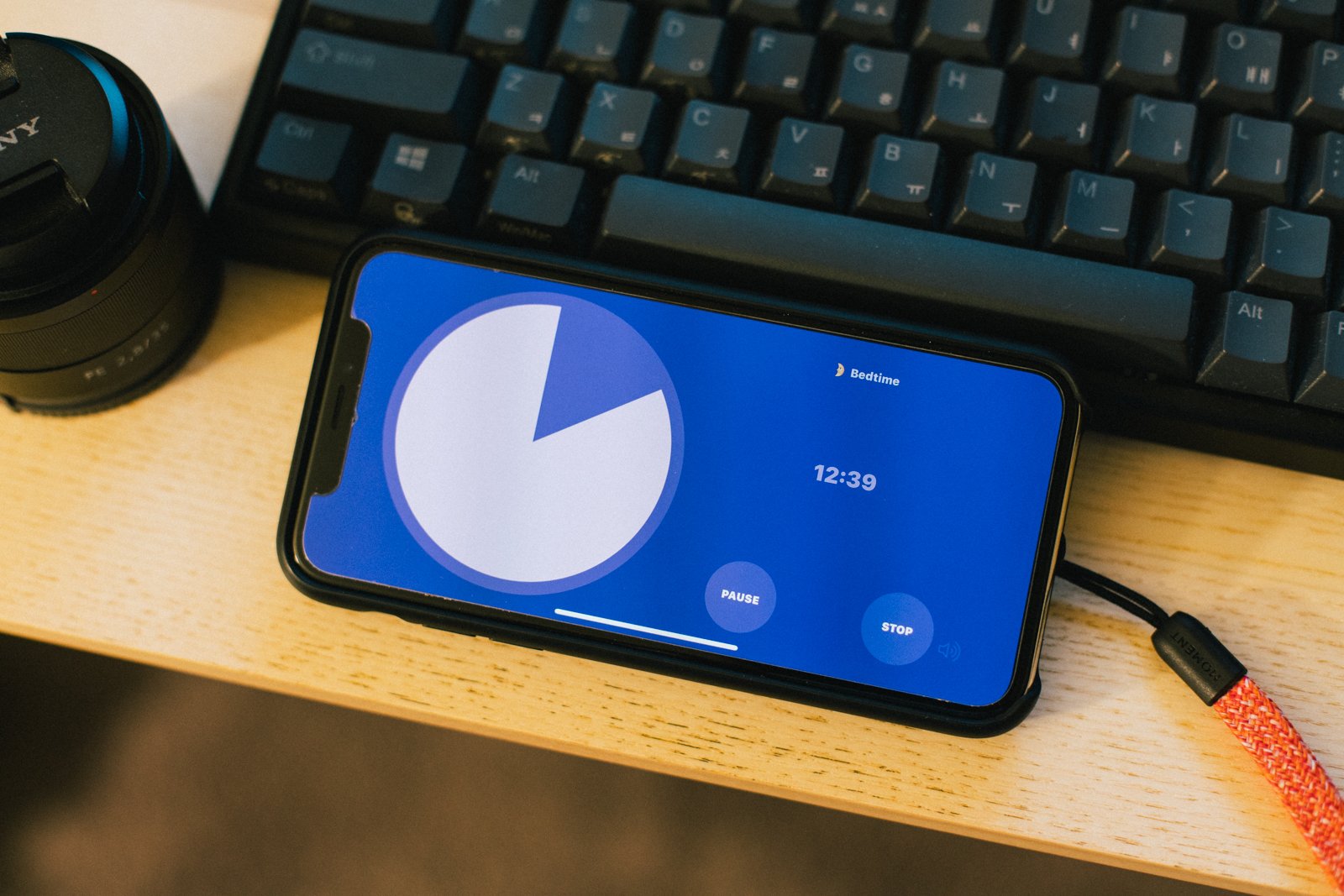
비주얼 타이머를 개발해서 2019년 6월에 출시했고 1년여 시간이 지나 1만 건 다운로드를 넘겼다. 현재는 목표로 했던 기능은 대부분 구현했고 성능 문제 개선, 사용자 피드백 적용을 고민하고 있다. 개발을 시작하면서 어렴풋이 정한 마일스톤인데 달성해서 기분 좋다.

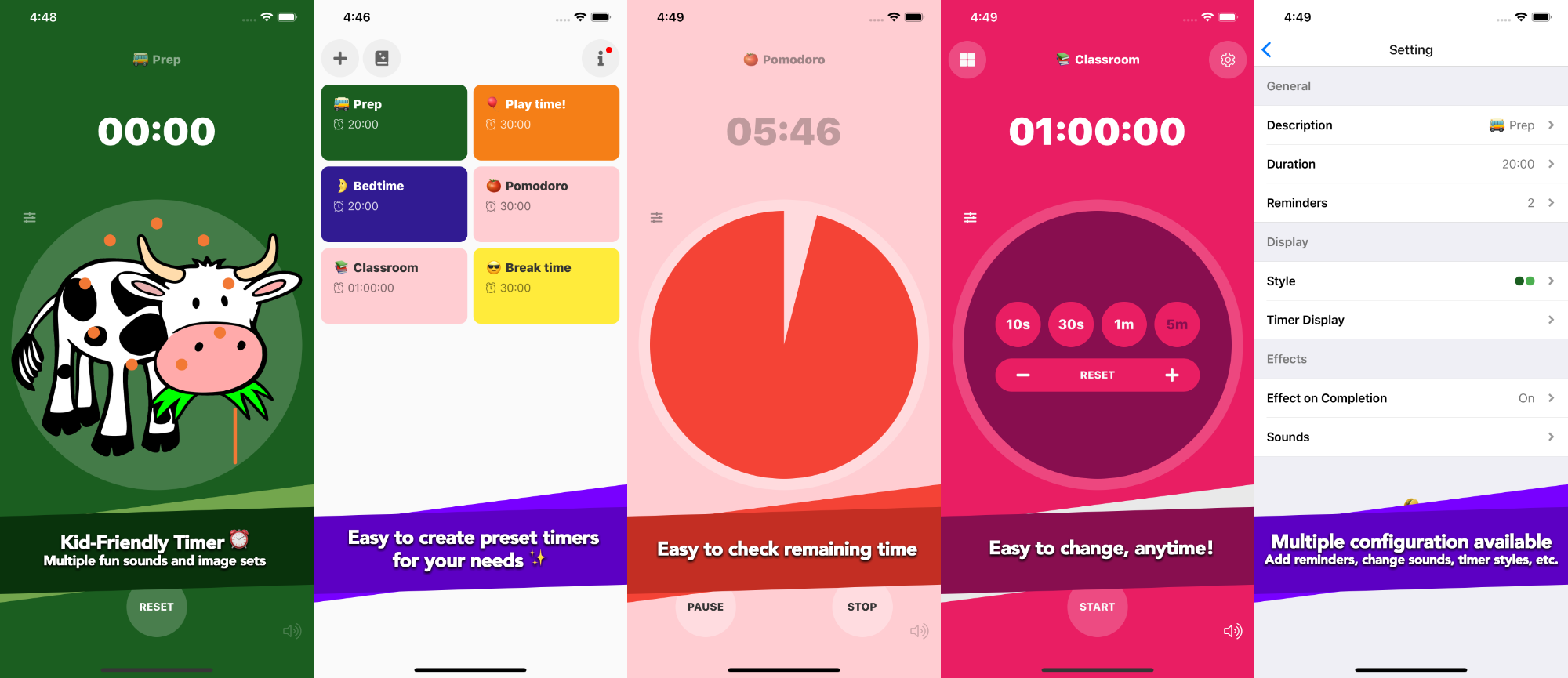
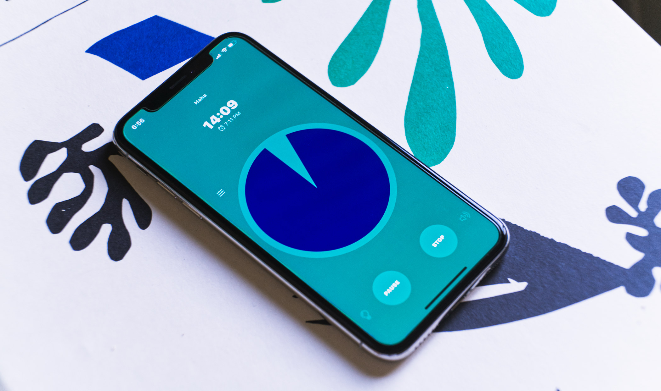
비주얼 타이머는 남은 시간을 직관적으로 확인할 수 있도록 진행 상황을 표시해주는 시각화 타이머로, 소리, 색상, 문구 등 다양한 개인화 기능을 제공한다. 앱은 React native를 사용했고 공지 등 서버 자원은 Azure Function App, 이슈와 리퍼지터리는 Github에서 관리했다.

1만 달성 🙌

개발 동기

  • 생산성 도구를 만들어보고 싶다
  • 프로젝트로 실무 감각을 유지하고 싶다
  • 사이드 프로젝트로 작은 앱은 만들어 봤으니 조금 큰 앱을 만들고 싶다
  • 애플 개발자 등록 비용이라도 벌고 싶다

개발 전

이전부터 생산성 도구에 관심이 많아 만들어보고 싶었다. 타이머는 나도 자주 사용하는 앱 중 하나였고 앱스토어에서 새로운 앱은 없나 종종 검색하기도 했었다. 생산성 앱을 만들겠다는 결정을 하고 나서 다음 과정을 거쳤다.

이전에 시험 삼아 만들어본 팁 계산기 앱에서 얻은 경험을 바탕으로 무슨 앱을 만들지 결정했다.

  • 앱 이름에서 제공하는 기능을 명확하게 알 수 있도록: 별도로 마케팅할 가능성이 작으니까 나는 앱스토어 검색에 최적화하는 쪽으로 기울었다. 앱스토어에서 다양한 키워드로 검색해보니 검색 키워드가 앱 이름이면 유명한 앱보다 먼저 검색 결과에 노출되는 경우가 많았다.
  • 앱스토어에서 검색했을 때 경쟁 앱이 적당히 있어야: 큰 카테고리에서는 검색 순위에 밀릴 수 있어도 조금이라도 카테고리가 좁아지면 상위 순위에 나와야 한다. 검색했을 때 경쟁 앱이 전혀 없다면 사람들이 검색하지 않는 키워드일 가능성도 크다.
  • 기존 앱에서 개선할 만한 부분 확인하기: 다른 앱도 사용해보고 그 앱 리뷰도 보고 업데이트 로그를 보니 이런 앱을 만들며 겪을 피드백과 개선 과정을 이해하는 데 도움이 되었다. (물론 로그를 대충 적는 앱, 이해하기 힘든 리뷰도 많지만)

타이머 자체 기능도 당연히 중요하지만 사소한 개인화 기능을 요청하는 리뷰가 많았다. 그래서 다양한 설정을 할 수 있는 타이머를 만들어보기로 했고 가능한 한 대부분의 설정을 변경할 수 있도록 계획했다. 그 중에도 아동을 대상으로 한 개인화 기능은 유료로 제공해서 수익을 만들기로 했다.

개발 과정

프로젝트는 React native를 사용하기로 했다. 웹앱은 생각보다 느린 반응이 눈에 보여서 Flutter와 RN 사이에서 고민했는데 지금은 많이 개선되었지만 당시에 Flutter로 만들었다는 앱을 써보니 웹앱보다는 빠르지만 약간 느린 인상을 받아서 RN으로 결정하게 되었다.

Expo도 편의 라이브러리가 많아서 좋지만, 결정 당시에는 한국어 입력 문제가 있어서 바로 react native를 사용하기로 했다.

초기에 고려하지 않은 탓에 큰 작업이 되었던 분할 화면

처음에는 공통으로 사용하는 컴포넌트를 만들어서 다른 프로젝트를 하게 되더라도 활용할 수 있도록 계획을 세웠다. 설정 저장/불러오기나 국제화 지원과 같이 전역에서 사용되는 라이브러리는 큰 문제 없이 계획한 방식대로 만들 수 있었다. 다만 생각처럼 되지 않은 부분은 표현 컴포넌트였다. RN에서 기본적인 컴포넌트를 많이 지원하긴 하지만 iOS 스타일의 크고 작은 표현 컴포넌트는 다른 라이브러리를 사용하거나 직접 만들어야 했다. 공개된 라이브러리가 많이 있지만 필요한 기능은 극히 일부인 데다 스타일 일관성을 맞추는 노력이 생각보다 많이 필요로 해서 직접 만들게 되었다. 이렇게 부분적으로 기능하는 컴포넌트는 당장에는 잘 동작하지만, 특정 상황만 고려해서 만든 탓에 다른 프로젝트에서 쓰기엔 조금 부족했다.

디자인은 iOS 기본 컴포넌트를 거의 따라가서 큰 막힘은 없었다. 아직도 약간씩 어색한 부분이 있지만 대부분 컴포넌트가 나름 비슷하게 동작한다. 그 외는... 좀 대충 만든 부분도 있지만 그래도 동작은 하니까 일단 뒀다. (타이머 순서 바꾸는 부분이라든지 매우 안 이쁘다.)

기능 중 완료 이미지 모음 리소스를 만드는 데 가장 많은 시간이 걸렸다. 완료 이미지 모음은 동물 등 이미지와 함께 이미지에 맞는 효과음이 타이머 완료 시에 표시되는 기능이다. 적합한 저작권을 가진 리소스를 찾고 정리해서 넣는 과정에 많은 시간을 썼다. 직접 일러스트라든지 그릴 수 있었다면 시간을 좀 더 줄일 수 있었을까.

서버는 Azure Function App을 사용하고 있는데 공지를 그냥 JSON 형식으로 내려주는 수준이라 별도의 데이터베이스 없이 작성했다. 그런 덕분에 응답도 빠르고 비용도 안 들어서 지금까지 그대로 유지되고 있다.

개발은 출시까지 4개월 정도 걸렸는데 개발은 1달 반에서 2달 정도 걸렸고 나머지는 앱 리소스(소리 효과, 이미지)와 앱스토어 메타 정보(앱 소개, 정책 등)을 준비하는 데 시간을 썼다.

사소하지만 품이 많이 드는 작업. 아이폰, 아이패드, 언어별로.

개발이 완료된 후에는 이상한모임 분들에게 테스트를 부탁해서 진행했다. 이 과정에서 앱이 어떤 맥락과 흐름에서 동작해야 하는지 피드백을 많이 주셔서 큰 도움이 되었다.

마케팅

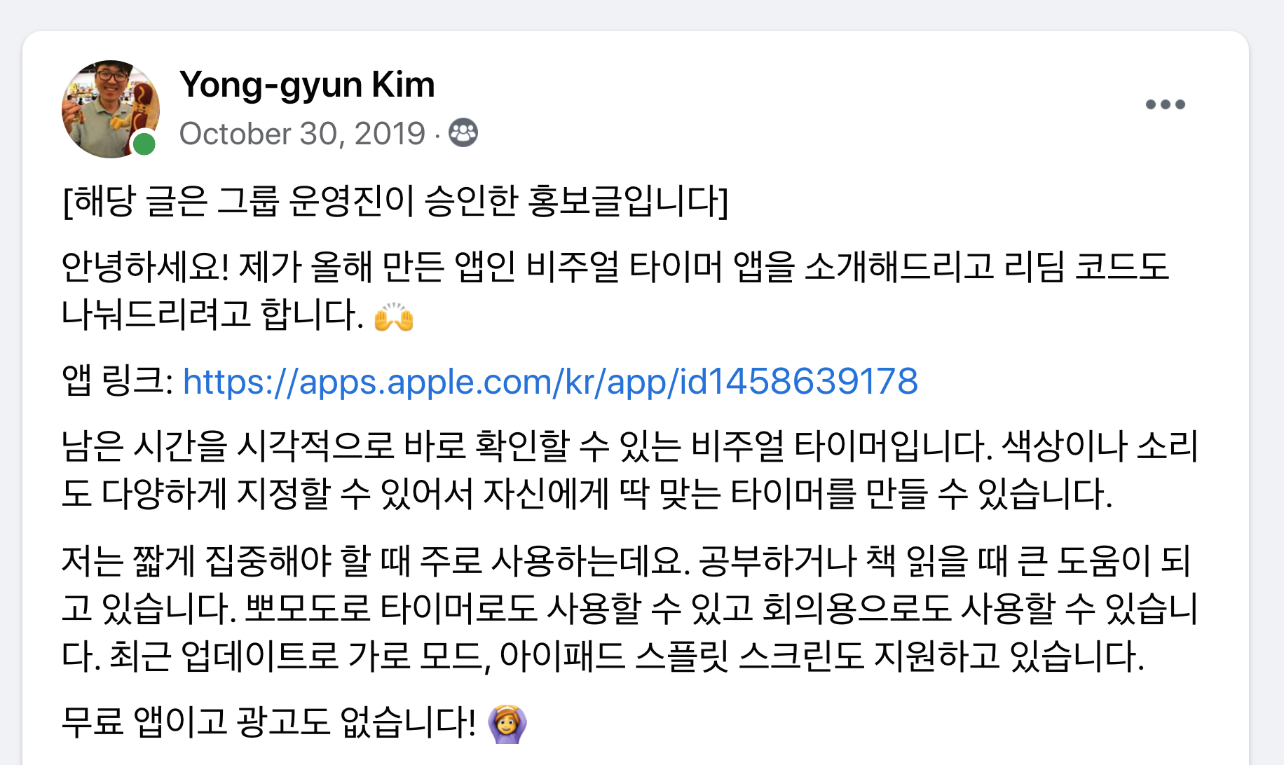
홍보는 페이스북 그룹, 이상한모임 채널, 클리앙, 내 소셜 계정에서 진행했다. 소개 글과 함께 프로모션 코드도 나눴다. 다운로드 수는 확실히 이런 홍보를 할 때마다 오르긴 했지만 액티브 유저 수 추세는 큰 변동이 없이 항상 일정하게 증가했다. 돈을 쓰지 않아서 그랬을까, 프로모션 코드도 돈이라고 생각한다면 업데이트마다 꽤 지출했다고 볼 수 있겠다.

가장 큰 도움이 되었던 Back to the Mac 그룹

페이스북 타깃 광고는 제공하는 도구로 확인해보니 적어도 광고 본 사람 중 30% 이상은 받고 결제해야 손익 분기인 비용이라 집행하지 않았다...

그래도 적은 수지만 앱스토어에서 검색해 받는 사람도 꾸준히 있다. 메타 정보를 작성하는 일도 생각보다 쉽지 않았다. 업데이트마다 조금씩 변경하고 있지만, 검색 지표가 명확하게 공개돼 있지 않아서 솔직히 잘 모르겠다. (어떤 키워드로 검색했는지 등)

검색 비중이 높다

개선과 피드백

앱 출시 이후 성능 문제를 계속 개선하고 있고 사용자 피드백도 그 과정에서 반영하고 있다. 초기에는 불안정하게 동작하는 부분이 있어서 못쓰겠다는 리뷰 받고 참담했는데 부지런히 안정화했다. 이 과정에서 Xcode의 프로파일링 도구가 큰 도움이 되었다.

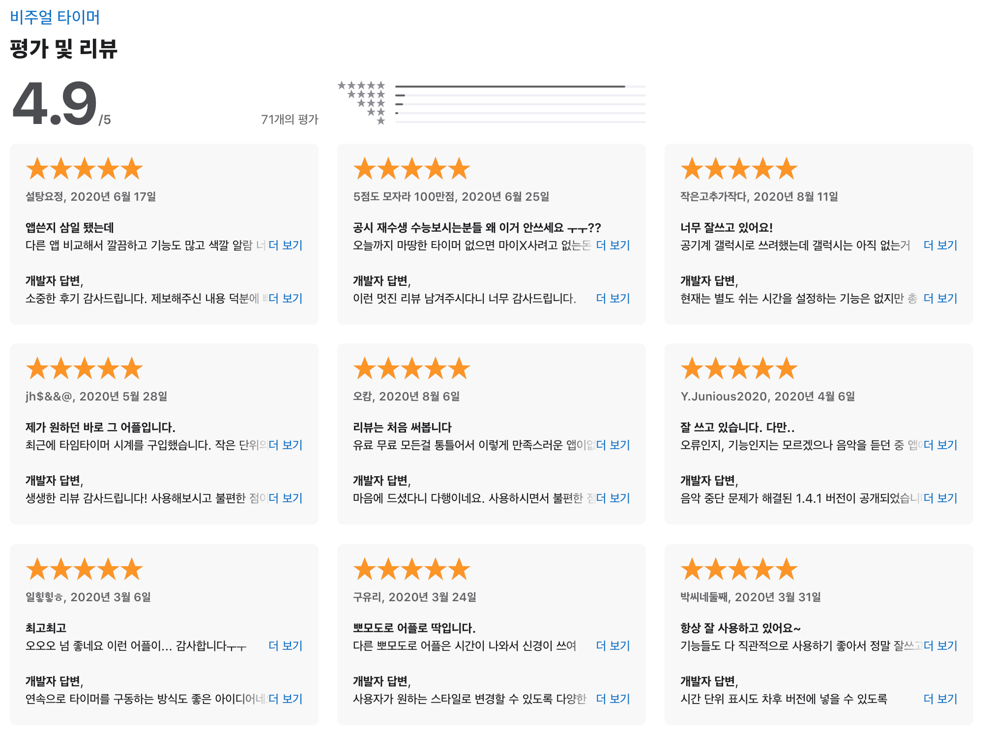
피드백은 앱 내 이메일 보내기로도 오지만 대부분은 앱스토어 리뷰로 남긴다. 만족도를 물어보고 이메일로 보낼지 앱스토어 리뷰로 보낼지 구분하겠다고 백로그에 적어두고는 그동안 잊고 지냈... 그동안 작은 피드백도 많이 받았는데 이미 개인화에 중점을 두고 만든 덕분에 대부분 피드백은 간단하게 추가할 수 있었다.

좋은 리뷰와 탄탄한 피드백은 늘 힘이 된다

다만 구조적인 변화가 필요한 피드백은 백로그로 쌓고 있다. 가령 여러 타이머를 동시에 사용하거나 순서대로 동작하도록 하는 방식은 현재 구조에서는 처음에 염두에 두지 않았던 부분이라 구현이 어렵다. 좀 더 정리해서 차기 버전에서는 구현할 수 있는 구조로 가고 싶다.

아쉬운 점

사용자 추적

앱스토어커넥트에서 제공하는 분석 도구는 피상적인 수준이라 실제 데이터를 볼 수 없다는 점이 늘 불편하다. 실제 사용은 앱을 실행했을 때 버전 확인과 공지 데이터를 받기 때문에 애저 펑션앱 사용량으로 확인할 수 있지만, 여전히 부족하다. GA 등 추적 도구를 사용해서 어떤 기능을 주로 사용하는지 등 데이터를 모으면 개발 방향을 잡는 데 더 도움이 될 텐데 그러지 않았다. 처음부터 이 부분이 중요하다는 이야기를 들었는데도 지금까지 적용하지 않은 것은 정말 반성해야 한다.

약한 수익 모델

현재는 인앱 결제로 수익이 발생하고 있다.

  • 완료 시 나오는 이미지 모음
  • 개발 지원하기

처음 앱을 기획할 때는 아동용 타이머로 방향을 잡고 있어서 완료 이미지 모음을 인앱으로 제공했다. 앱을 공개한 이후에는 아동용 타이머 외에 일반 용도로 많이 사용하길래 커피 지원하기 같은 개발 지원 항목을 추가했다. 한국에서는 개발 지원이, 미국 스토어에서는 이미지 모음 결제가 많다. 내가 쓰는 시간을 생각하면 아직도 많이 부족하지만 그래도 앱개발자 등록 비용은 해결할 수 있게 되었다.

다음 버전에서는 인앱을 정리하고 유료로 전환하는 것을 고민하고 있는데 이런 결정은 어떻게 해야 하는 걸까, 사용자에게 무슨 가치를 주고 있는지, 그 비용은 어떻게 결정해야 할지 배우고 싶다.

안드로이드 지원

처음에는 RN이면 안드로이드 지원은 저절로 되겠지 생각했는데 실제로 돌려본 결과는 처참했다. iOS는 그래도 작게나마 해본 경험이 있어서 트러블슈팅도 큰 문제가 없었는데 안드로이드는 구동 자체도 쉽지 않았다. 차기 버전에서는 안드로이드도 같이 지원하고 싶다.

자동화와 테스트 부족

지금 앱은 일부 로직에 유닛테스트가 있지만, 아직 많이 부족하고 자동화도 없다. 앞으로 개선해야 하는 부분이다.

잘한 점

React Native

React로 많은 프로젝트를 해보지 않았는데 이 앱을 만들고 관리하면서 많이 배웠다. 정말 매달 새로운 기능과 라이브러리에 눈과 머리가 바쁘다. 출시 이후에도 react에 hook도 들어오고 많은 새 기능이 들어오고 있는데 업데이트 과정에서 조금씩 적용하고 개선하며 많이 배우고 있다.

확실히 js나 react에 경험이 있다면 큰 문제 없이 RN 프로젝트도 꾸릴 수 있다. 물론 타깃 플랫폼도 잘 알면 더 편하다. 특히 기능이나 용어는 각 타깃 플랫폼에서 제공하는 용어로 많이 설명되고 있어서 안드로이드와 iOS의 용어 차이를 알아두는 것도 도움이 됐다.

다국어 지원

처음부터 고려하지 않았다면 꽤 번거로운 작업이 되었을 텐데 지금 와서는 잘 한 결정 중 하나다. 현재 영어랑 한국어만 지원하지만 지금까지 지역 통계를 보면 확실히 도움이 되었다. 마케팅도, 프로모션도 대부분 한국에 했는데 다운로드 비율이나 수익 비중은 미국이 더 크다.

프로모션 코드는 한국에서 많이 뿌렸는데 조금 억울

우선순위와 시간 관리

혼자 하는 프로젝트는 내 마음대로 할 수 있다는 장점이 있지만, 한편으로는 정말로 제한적인 시간 자원을 어떻게 관리하는가 하는 점이 정말 큰 어려움이었다. 특히 내가 안 하면 아무것도 진행이 되지 않는다는 점이 당연하지만 피곤했다.

다행히 처음에 계획한 최소 기능은 대부분 만들어냈고 학업 하면서도 크고 작은 개선 작업을 진행했다. 출시 이후에는 적은 분량이라도 한 달에 한 번은 업데이트 할 수 있도록 노력했다. 지금까지 받은 피드백 중 적용된 것은 일부지만 개선 과정에서 좋은 리뷰도 많이 받을 수 있었다.


이 이전에도 앱을 만들어본 경험은 있지만, 하루 정도면 만들었던 수준의 앱과는 경험의 깊이가 달랐다. 특히 앱은 웹과는 확실히 다른 맥락과 인터페이스를 갖고 있었다. 앱을 출시하는 경험은 평소라면 별 생각 없이 쓰던 수많은 앱을 교과서처럼 보이게 했다. 아름답고 멋지고 편리한 기능을 모두 앱에 적용하고 싶었지만 작아도 정교한 기능은 보는 것과 다르게 훨씬 많은 시간을 필요로 했다. 쉽진 않겠지만 다음엔 그런 부분도 꼼꼼하게 구현해보고픈 욕심도 생겼다.

지금 이렇게 되돌아보면 잘한 점보다 부족한 점도 많고 배워야 할 부분도 산더미다. 그래도 부족한 부분이 많지만 유용하게 사용하고 있다는 리뷰 하나하나가 큰 힘이 됐다. 앞으로 개선될 타이머와 만들어갈 많은 프로젝트에서도 이런 경험이 거름이 되었으면 좋겠다.

애플 앱스토어에서 보기

웹페이지 다크 모드 지원은 prefers-color-scheme 미디어 쿼리를 사용해서 적용할 수 있다. 각 해상도에 따라 미디어 쿼리를 적용하는 방식과 크게 다르지 않다.

.title {
    color: #101010;
}

.desc {
    background-color: darkorange;
}

@media (prefers-color-scheme: dark) {
    .title {
        color: #EFEFEF;
    }
    .desc {
        background-color: peachpuff;
    }
}

이제 해당 페이지는 다크 모드로 지정했다면 해당 스타일로 적용된다. CSS 프로퍼티로 정의하면 자료와 구조를 분리할 수 있어 좀 더 깔끔해진다.

:root {
    --title-color: #101010;
    --desc-color: darkorange;
}

@media (prefers-color-scheme: dark) {
    :root {
        --title-color: #EFEFEF;
        --desc-color: peachpuff;
    }
}

.title {
    color: var(--title-color);
}

.desc {
    background-color: var(--desc-color);
}

사용자가 시스템에서 설정한 대로 보이긴 하지만 웹페이지에서 직접 변경할 수 있도록 옵션을 제공할 수도 있다. localStorage에 설정을 저장해서 다시 웹페이지에 접속할 때 마지막 설정을 불러올 수 있다.

:root {
    --title-color: #101010;
    --desc-color: darkorange;
}

@media (prefers-color-scheme: dark) {
    :root {
        --title-color: #EFEFEF;
        --desc-color: peachpuff;
    }
}

[data-theme="light"] {
    --title-color: #101010;
    --desc-color: darkorange;
}

[data-theme="dark"] {
    --title-color: #EFEFEF;
    --desc-color: peachpuff;
}

/* ... */

저장된 값이 있다면 페이지에 설정한다.

const theme = localStorage.getItem('theme');
if (theme) {
    document.documentElement.setAttribute('data-theme', theme);
}

시스템 설정을 확인하기 위해서 window.matchMedia() 함수를 사용할 수 있다. CSS의 미디어 쿼리가 현재 페이지에 해당하는지 확인하는 기능을 제공한다.

function toggleTheme() {
    // 저장된 값이 없다면 시스템 설정을 기준으로 함
    const currentTheme = localStorage.getItem('theme')
        || (
            window.matchMedia("(prefers-color-scheme: dark)").matches
            ? 'dark'
            : 'light'
        );
    const newTheme = currentTheme === 'dark' ? 'light' : 'dark';

    // 최상위 엘리먼트에 설정, 로컬 스토리지에 설정을 저장
    document.documentElement.setAttribute('data-theme', newTheme);
    localStorage.setItem('theme', newTheme);
}

만약 미디어 쿼리의 결과를 동적으로 반영해야 하는 경우에는 window.matchMedia()의 반환값인 MediaQueryList에 이벤트 리스너를 추가할 수 있다.

const mql = window.matchMedia("(prefers-color-scheme: dark)");

mql.addEventListener((e) => {
    if (e.matches) {
        // 해당 미디어 쿼리가 참인 경우
    } else {
        // 해당 미디어 쿼리가 거짓인 경우
    }
});

동네가 그렇게 치안이 나쁜 것은 아니지만 가끔 동네 페이스북 그룹이나 넥스트도어 같은 곳에서 접하게 되는 크고 작은 사건 탓에 집을 비울 때 조금 걱정이 있었다. 그나마 보안 카메라를 설치하고 나서는 불안감은 줄어들긴 했지만 누가 봐도 집에 있는지 없는지 밖에서 판단할 수 없었으면 싶었다. 이전에 코스트코에서 구입한 WeMo 플러그로 조명을 켜고 끌 수 있었지만 아무래도 연결하는 조명이 스탠드 정도라서 만족스럽지 않았다. 그래서 기존 벽 스위치를 교체하는 방법을 알아보다가 wifi 스위치를 구입해서 설치하게 되었다.

물론 고민하고 찾아볼 필요 없이 기술자를 부르면 금방 끝날 일이다! 전기 공사는 정말 위험할 수 있는 일이기 때문에 무슨 작업이 어떻게 필요한지 정확히 모른다면 전문가를 찾는 것이 맞습니다.

자격과 규정 확인하기

캘리포니아도 전기 공사를 하려면 자격이 필요하다. 다만 프로젝트의 크기가 자재와 인건비 포함 $500 미만인 경우에는 CA B&P Section 7048 (Small Operations)에 따라서 자격 없이도 가능하다. 스위치 4개 교체하는 수준이고 유튜브 영상 보고 크게 시간 걸리는 작업도 아닌 것 같아서 직접 해야겠다고 판단했다.

미국은 National Electrical Code(NEC)를 주기적으로 발행하고 그 NEC를 기준으로 각 주마다 전기 공사 규정(electrical code)이 존재한다. 각 주, 지역마다 적용되는 전기 공사 규정이 다르고 규모에 따라 허가(permit)가 필요한 경우도 있다. 전기 기술자를 통해 설치한다면 이 부분도 확인해달라고 하면 된다. 나는 내가 설치하려고 했기 때문에 시청에 문의했고 단순 스위치 교환에는 별도의 허가 없이 가능하다는 답변을 받았다.

중성선 확인하기

한국과 미국은 전력 공급 방식이 다르다. 한국은 주로 단상 2선식으로 220V만 공급되는 것에 비해 미국은 단상 3선식으로 110V와 240V가 공급된다. 일반적으로 벽 플러그는 110V만 쓸 수 있지만 전기 오븐과 같이 전력을 많이 쓰는 가전은 240V로 연결되어 있다.

스위치도 어떤 스위치냐에 따라 조금씩 다르지만 Wifi 단일 스위치라면 일반적으로 다음 4개의 선을 연결해야 한다.

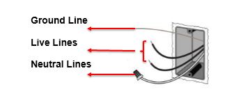
  • Line/Hot wire (주로 빨강 또는 검정): 전력 공급 선
  • Load wire (주로 검정): 설치된 기기(전등)에 연결된 선
  • Ground wire (주로 노출된 구리선 또는 녹색): 접지선
  • Neutral wire (주로 흰색): 중성선, 회로를 완료할 수 있도록 배전반에 연결된 선

스위치의 역할은 공급되는 전력을 전등에 연결하거나 차단하는 역할을 한다. 스위치가 전기를 연결하게 되면 전기가 전등을 거쳐 다시 전력이 공급되는 곳으로 돌아간다. 회로가 연결되는 것으로 전력은 공급되고 전등은 불이 켜진다.

기계식 스위치는 끄면 물리적으로 전등에 전달되는 전기를 끊게 된다. Wifi 스위치는 끈 상태에서도 전력이 계속 있어야 하기 때문에 스위치를 켜지 않은 상태에서도 회로가 연결되어 있어야 한다. 그 회로를 완료하는 역할을 중성선이 수행하게 된다. 그래서 중성선 여부가 중요하다.

중성선은 2009년 NEC 이후에 필수가 되었기 때문에 최근에 지어진 건물이라면 중성선이 존재할 가능성이 높다. 만약 중성선이 없다면 중성선을 설치해야 하는데 이 경우는 기술자가 필요하고 이런 추가 작업은 대부분 허가가 요구된다. 대안이라면 중성선을 필요로 하지 않는 wifi 스위치를 찾아야 하는데 그런 제품은 자체 베터리를 사용하며 UL 인증 제품이 아닐 수 있으니 유의해야 한다.

스위치 결정하기

시중에 나와있는 스위치가 상당히 많고 리뷰도 다양하다. 저렴한 제품도 많지만 대부분 저렴한 이유가 있다. UL 인증을 받은 제품인지 확인하는 것이 가장 중요하다. 이 인증이 없다면 집 보험에 문제가 생길 수 있다. UL listed인지 구입 전에 꼼꼼하게 확인해야 한다. 저렴한 제품 중에는 UL listed라면서 실제로는 그렇지 않은 경우도 있다고 하니 주의해야 한다.

UL listed

어떤 네트워크를 사용하는지도 염두해야 한다. Wifi 외에도 Z-Wave, Zigbee 등 다양한 규격이 존재한다. 만약 Ring 등 보안 시스템이 있고 거기에 연결해서 쓴다면 호환 여부도 확인해봐야 한다. 스위치 설치할 곳의 wifi 신호도 염두해야 한다. 신호가 약하면 당연히 잘 동작하지 않는다.

구글 홈이나 아마존 에코 연동 여부도 확인해야 한다. 사용하는 제품이 있다면 연동을 지원하는지 확인한다.

어떤 스위치를 교체할지도 미리 고민해야 한다. 스위치 종류는 단일 스위치, 여러 위치에서 끄고 켤 수 있는 3 way 혹은 4 way 스위치, 밝기를 조절할 수 있는 디머 스위치(dimmer) 정도로 구분된다.

Lutron, GE, TP-Link를 후보로 두고 리뷰를 보다가 TP-Link를 골랐다. Lutron도 유명하다는데 처음 들어봤고 GE 제품은 Z-wave에 더 중점을 두고 있었다. TP-Link는 wifi 기반이고 리뷰도 크게 나쁘지 않은 데다 앱도 괜찮았다. tplink-smarthome-api 같은 라이브러리도 있어서 나중에 필요에 따라 제어하는데 더 편리할 것으로 보고 결정했다.

필요에 맞게 TP-Link Kasa HS200, HS220 v2 제품을 구입했다.

설치하기

설치에는 다음 도구가 필요했다.

  • 스크류 드라이버
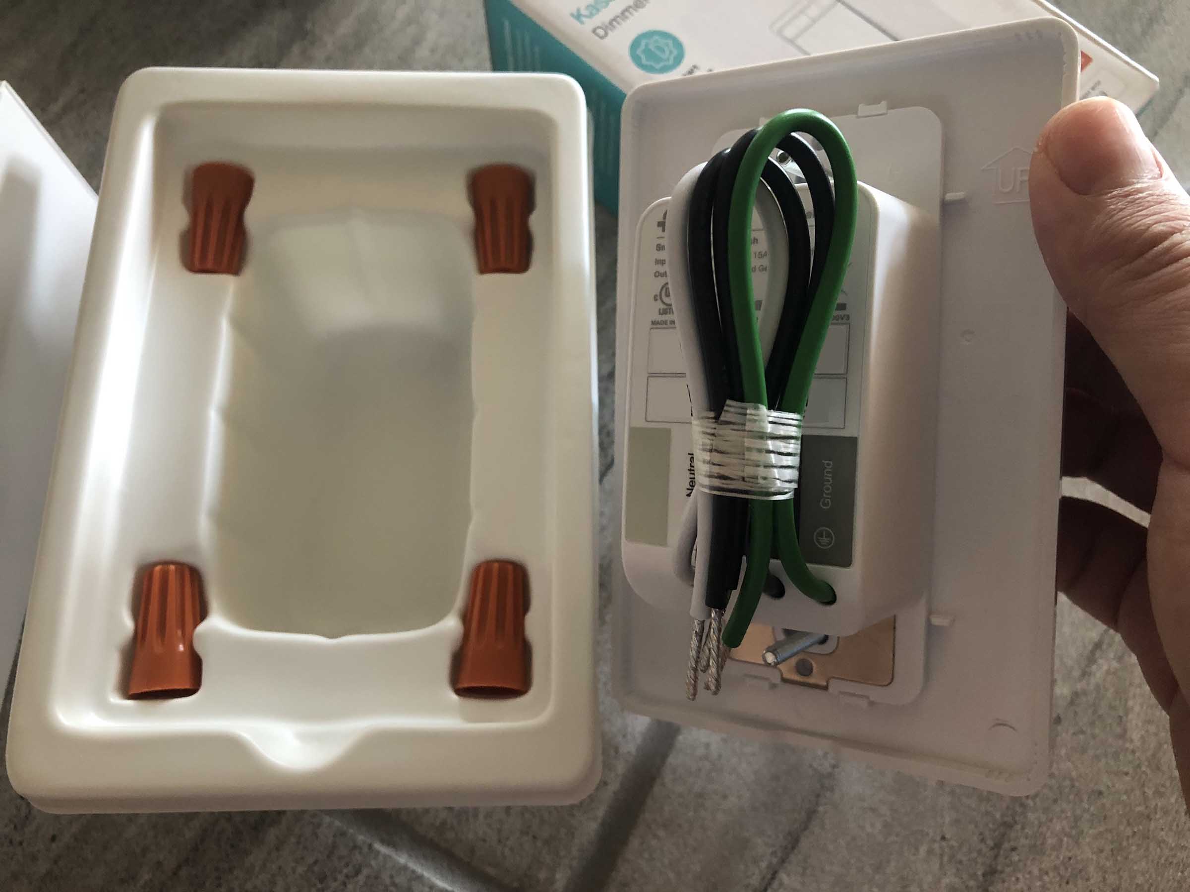
  • 와이어 넛 (wire nuts): 결선에 필요한데 TP-Link 제품에 포함되어 있었음
  • 전기 테스터(electrical tester): 비접촉식 제품이나 멀티미터를 사용
  • 다용도 칼: 스위치 패널과 페인트가 붙어 페인트가 흉하게 뜯어질 수 있어서 분리 전에 패널과 벽 사이를 칼로 그어준다.
  • 스위치

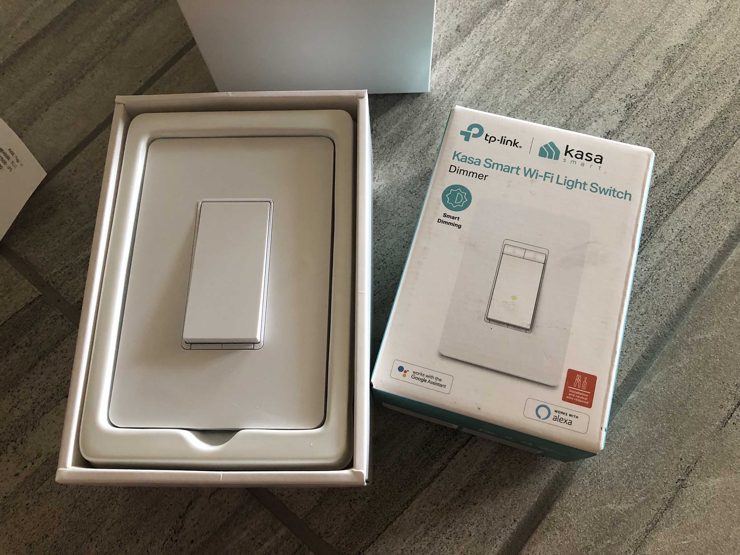
구입한 스위치. 별도 설명서는 없고 TP Link 웹사이트에서 제공한다.

먼저 전력 차단기를 내려야 한다. 차단기에 어느 구역 차단기인지 표시가 되어 있다면 확인하고 내린다. 없다면 전등 스위치를 켜놓고 차단기를 내려 전등이 꺼지는지 확인한다.

드라이버로 나사를 풀고 스위치 패널을 연다. 전기 테스터로 아직도 전력이 흐르는지 확인한다. 스위치를 분리하고 wifi 스위치를 연결한다.

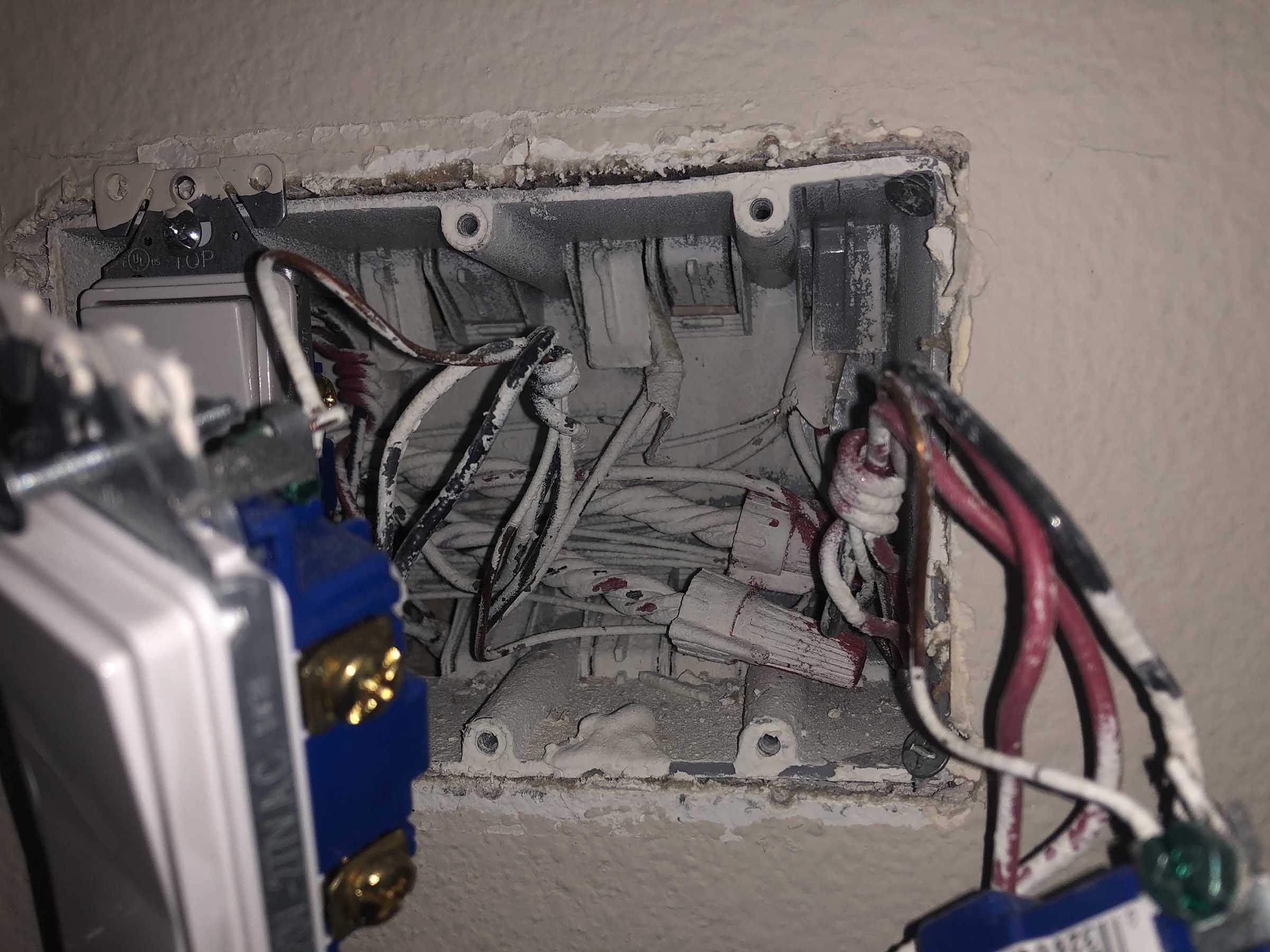
페인트 때문에 잘 안보이지만 중성선이 안쪽에 있다. 오른쪽 스위치도 할 수 없이 분리했다.

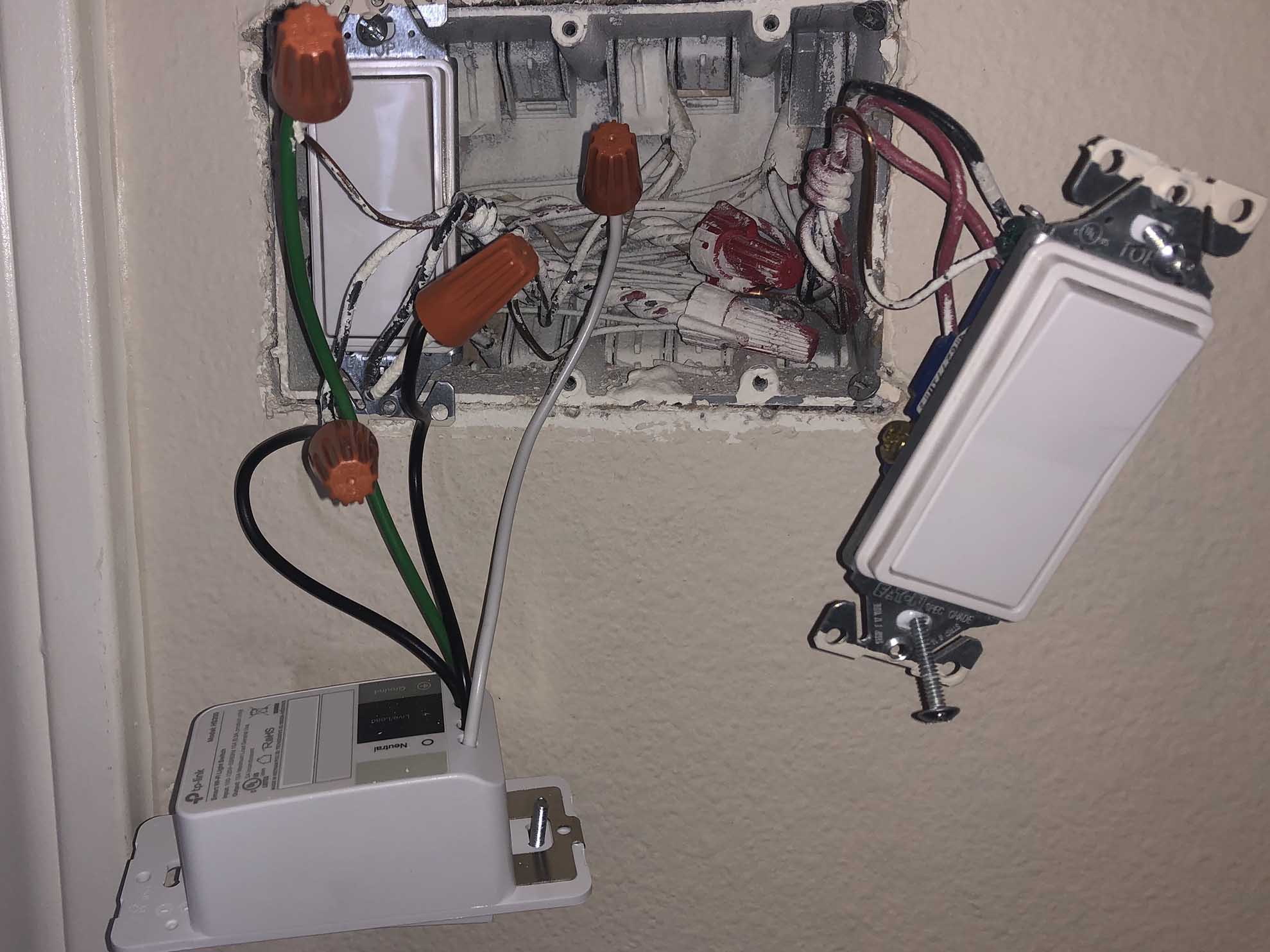
선은 끝을 맞춰 나란히 잡고 와이어 넛을 끼워 돌린다. line/load은 구분 없이 꽂으면 된다. 와이어 넛이 더이상 돌아가지 않을 때까지 돌리면 된다. 연결한 후에 선의 노출 부분이 밖에서 보이지 않아야 한다.

연결된 모습

선을 잘 정리해서 스위치를 제자리에 부착한다. 선이 접히지는 않았는지, 닿으면 안되는 선에 닿지는 않았는지 확인하고 잘 넣는다. 차단기를 올리고 제대로 동작하는지 확인한다.

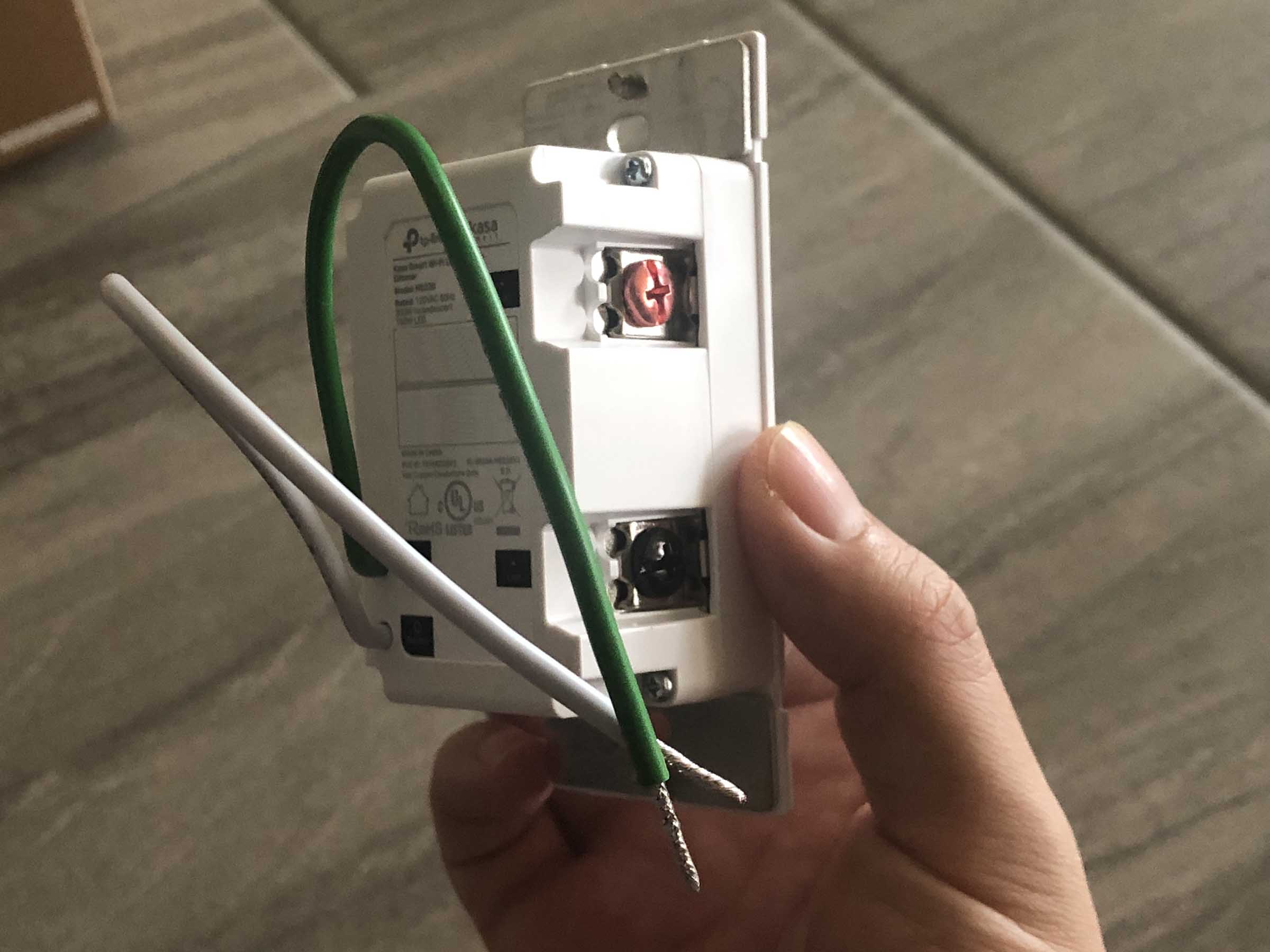
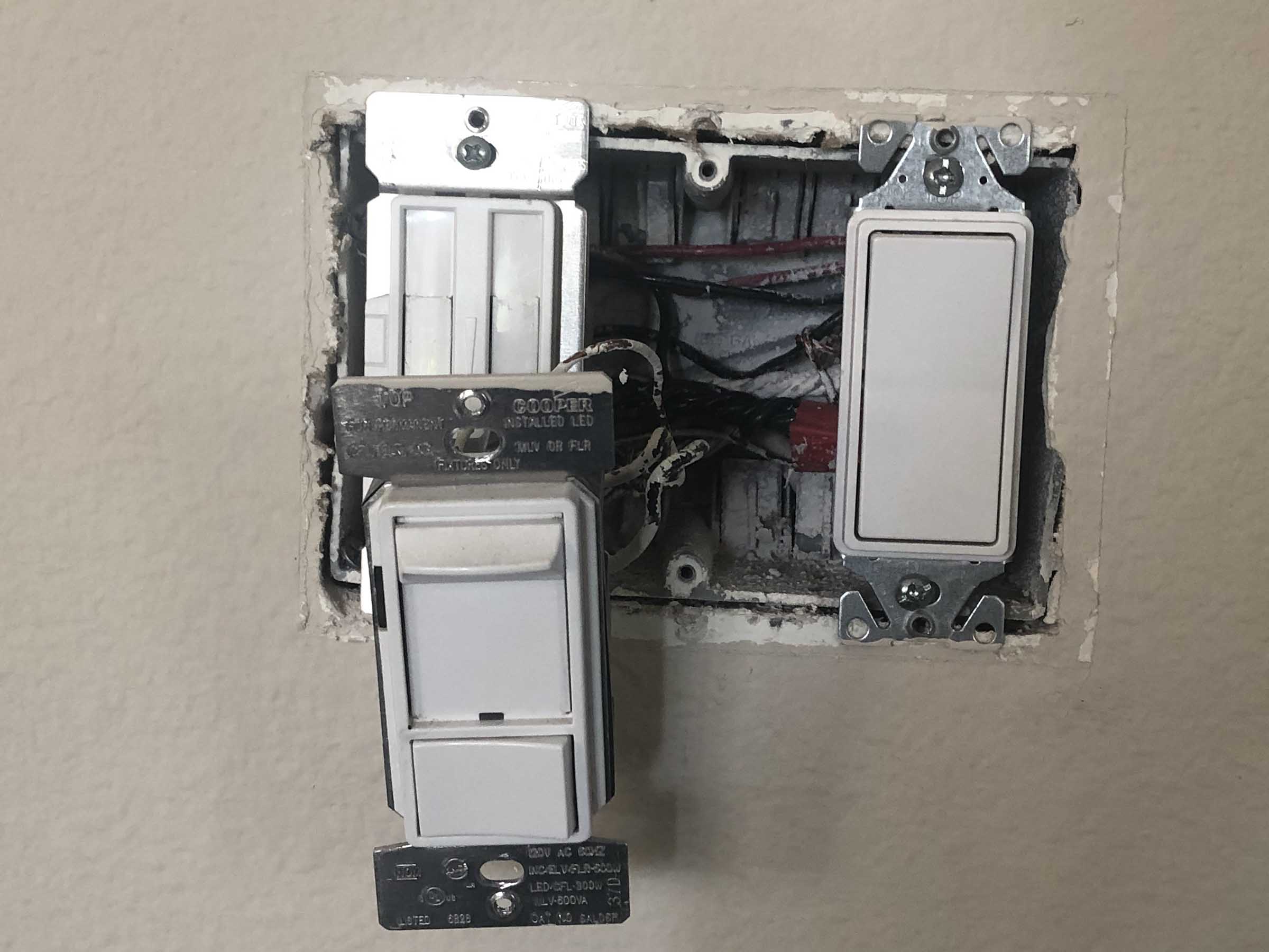
디머 스위치는 line/load 구분이 필요하다. 기존 연결된 스위치를 참고하면 도움이 된다. 일반 스위치와 동일하게 차단기를 내리고 테스터로 확인하고 작업을 시작한다.

기존 디머 스위치에 어떤 선인지 표시되어 있어서 쉽게 교체했다.

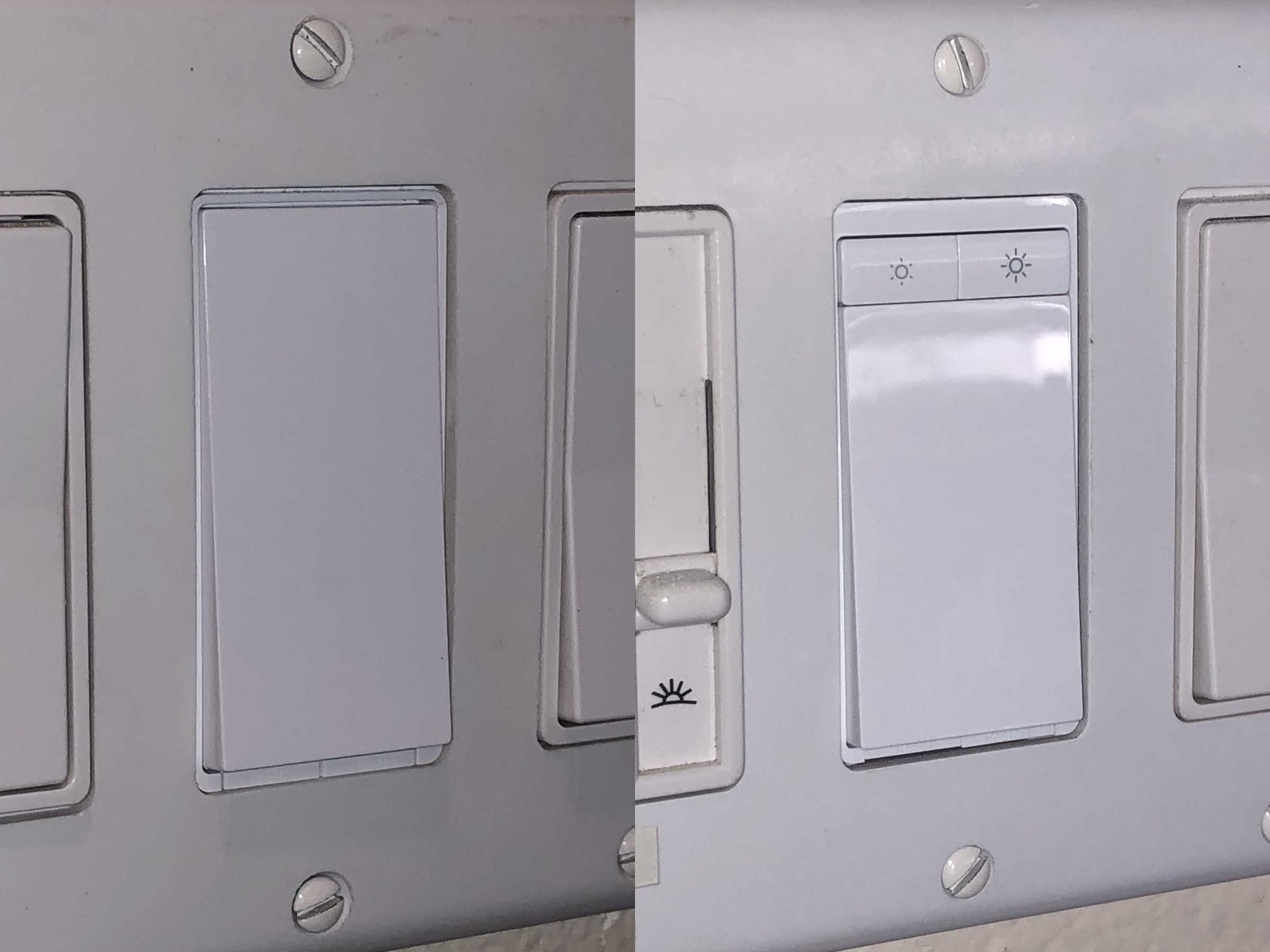
설치 완료

TP Link 앱을 설치하고 wifi에 등록하면 끝난다.

활용

TP Link 앱도 생각보다 깔끔하고 큰 문제 없이 잘 동작했다. 기존 사용하던 WeMo는 앱이 정말 불안정하고 wifi가 오락가락할 때가 자주 있었는데 TP Link는 훨씬 깔끔하고 잘 동작한다. 게다가 집에서 구글 홈을 사용하고 있고 WeMo를 가끔 못찾을 때가 있어서 답답했는데 스위치는 잘 동작해서 좋다.

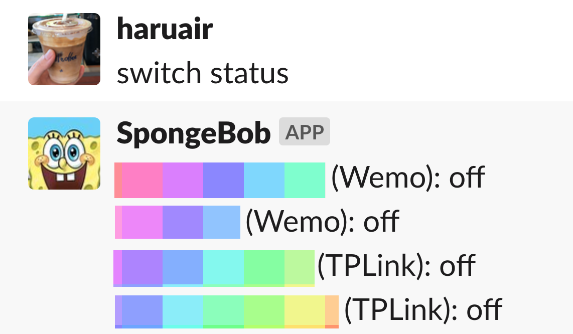
집에 연결된 모든 장비는 slack에도 hubot으로 제어할 수 있는데 새 스위치도 쉽게 연결할 수 있었다.

매우 잘 동작 ✨

자는 시간을 제외하고는 대부분의 시간을 크고 작은 화면을 본다. 특별한 내용이 없더라도 화면을 스크롤 하는 일이 일상이다. 누군가와 함께 앉아 있더라도 잠시나마 서로 화면을 보느라 조용해지는 시간도 종종 있다. 그렇게 많은 시간을 쓰고 있다는 것을 나도 잘 알지만, 장점이 있다고만 생각해왔었다. 새로운 정보를 빠르게 습득할 수 있다든지, 잠깐 물 뜨러 가면서도 비는 시간 없이 무언가를 볼 수 있다는 점에 내가 자투리 시간을 잘 활용하고 있다는 기분도 들었다.

그래서 디지털 미니멀리즘이라는 제목만 보고도 대충 덮어놓고 지냈던 내 습관을 마주해야 했다. 가끔 스마트폰을 너무 많이 들여다보면 며칠 쉬어보기도 했지만, 순간뿐이었다. 스크린 타임을 설정하고도 15분 제한 무시를 수시로 누르다가 결국은 기능을 꺼버린다. 나는 어째서 절제하지 못하는가, 그런 죄책감을 느끼면서도 또다시 수시로 화면을 봤다.

디지털 미니멀리즘에서는 이런 중독에 가까운 증상이 주의력을 기반으로 움직이는 기업을 문제로 삼았다. 프로덕트나 서비스에 오래 체류할수록 수익이 느는 기업은 어떤 방식을 사용해서든 그 시간을 늘리려고 한다. 마치 슬롯머신을 돌리는 것처럼 스크롤을 돌리면 새로 고침과 함께 내가 원하는 정보가 튀어나올 것처럼 디자인했다는 것이다. 단순히 비약이라고 하기에는 내 행동을 돌아봤을 때 그렇게 사실이 아니라고 단정적으로 말하긴 어려웠다. 나도 아침부터 저녁까지 스크롤을 손으로 당겼으니까. 당길 때마다 달라지는 타임라인과 뉴스피드를 보기 바빴으니까. 내 주의력을 내어주고 쓸 만큼 나에게 도움이 되는가 생각해보면 솔직히 부끄러운 마음만 든다.

책에서는 철저하게 멀어진 후에 다시 각 도구와 서비스의 가치를 세심히 평가하고 삶에 도입하는 방식을 이야기한다. 예를 들면 트위터는 일주일 또는 하루 중 정해진 시간만 확인한다. 그리고 정말로 필요한 정보만 볼 수 있도록 세세한 필터를 지정한다. 이런 방식은 이렇게 해야 한다고 정해진 것이 아니라 정말 자신에게 필요한 것인가를 심사숙고하는 과정에서 결정되어야 한다고 이야기한다. 책에서도 다양한 사람들의 다양한 접근 방식을 설명하고 있고 자신에게 맞는 방법을 고를 수 있도록 돕는다.

물론 이런 책 한 권 보고 짠! 하고 바뀌진 않았다. 나도 책에서 제안하듯 단호하게 끊지 못했다. 책을 덮고 나서도 여러 차례 시도했는데 잠깐의 틈이라도 생기면 화면을 보는 내 모습에 좀 더 심각성을 느꼈다. 내 산만함을 정돈할 좋은 기회가 되었으면 좋겠다.


디지털 미니멀리즘: 딥 워크를 뛰어넘는 삶의 원칙. 칼뉴포트 저, 김태훈 역. 세종서적.

이 포스트는 usability.govUser Interface Design Basics를 번역한 글입니다.

사용자 인터페이스(User Interface, UI) 디자인은 사용자가 할 작업을 예측해서 인터페이스의 엘리먼트에 쉽게 접근하고 이해할 수 있는가, 그리고 손쉽게 사용할 수 있는가에 중점을 둡니다. UI는 상호작용 디자인, 시각 디자인, 정보 아키텍처의 개념을 통합하고 있습니다.

인터페이스 엘리먼트 선택

사용자는 이미 특정 방식으로 동작하는 인터페이스 엘리먼트에 익숙합니다. 그러므로 그 사용자 경험에 일관성이 있어 사용자가 예측할 수 있는 엘리먼트와 레이아웃을 선택하도록 합니다. 그런 선택은 사용자가 업무를 능률적이고 만족스럽게 완료할 수 있는데 도움 됩니다.

인터페이스 엘리먼트는 다음과 같지만, 이 목록이 전부는 아닙니다.

  • 입력 컨트롤: 버튼, 텍스트 필드, 체크박스, 라디오 버튼, 드롭다운 메뉴, 목록 박스, 토글, 날짜 필드
  • 탐색 컴포넌트: 브레드크럼, 슬라이더, 검색 필드, 페이지네이션, 태그, 아이콘
  • 정보성 컴포넌트: 툴팁, 아이콘, 프로그레스 바, 알림, 메시지 박스, 모달 윈도우
  • 컨테이너: 아코디언

내용을 표시할 때 여러 엘리먼트를 사용해야 적절한 예도 있습니다. 그런 상황에서는 균형을 찾는 것이 중요합니다. 예를 들어서 엘리먼트를 사용했을 때 공간을 절약할 수 있는 예도 있지만, 사용자에게 드랍박스 메뉴 또는 해당 엘리먼트에 무엇이 있는지 추측하도록 강제하기 때문에 정신적인 부담감을 줄 수도 있습니다.

인터페이스 디자인의 모범 사례

모든 디자인은 사용자를 아는 것에 근간을 둡니다. 그 이해는 사용자의 목표, 기술 수준, 선호도와 경향도 포함합니다. 사용자를 이해한 다음에는 인터페이스를 디자인할 때 다음 항목을 염두에 둬야 합니다.

  • 인터페이스를 단순하게 유지합니다. 모범적인 인터페이스는 사용자에게 거의 보이지 않습니다. 불필요한 엘리먼트는 피하고 명확한 언어로 레이블이나 안내를 넣어줍니다.
  • 일관성을 유지하고 일반 UI 엘리먼트를 사용합니다. 일반 엘리먼트를 UI에서 사용하면 사용자는 더 편하게 느끼고 더 빨리 적응할 수 있습니다. 언어, 레이아웃, 디자인을 아우르는 일정한 패턴을 만드는 일도 중요합니다. 이런 패턴은 사용자가 더 효율적으로 도구를 사용하는 데 도움이 됩니다. 사용자가 한번 사용법을 습득하면 같은 프로덕트의 다른 부분에서도 그 사용법을 동일한 방식으로 쓸 수 있어야 합니다.
  • 레이아웃의 목적이 명확해야 합니다. 항목과 페이지의 공간적 관계를 고려합니다. 그리고 중요도를 기준으로 페이지의 구조를 잡아야 합니다. 주의 깊게 배치된 항목은 사용자가 가장 중요한 정보 조각에 집중하는 데 도움이 됩니다. 또한 빠르게 살펴보는 일도 쉬워지고 가독성도 개선됩니다.
  • 전략적으로 색상과 텍스처를 선택합니다. 사용자가 각 항목에 집중하거나 집중하지 않도록 색, 빛, 대조나 텍스처를 활용할 수 있습니다.
  • 타이포그래피로 계층 구조를 만들고 명료성을 높입니다. 어떤 서체를 사용할지 유의합니다. 다양한 크기와 서체, 정렬 방식은 사용자가 쉽게 훑어보게 만들며 시인성과 가독성을 높일 수 있습니다.
  • 시스템이 지금 일어나는 일을 파악할 수 있게 합니다. 항상 사용자에게 위치, 동작, 상태의 변화나 오류를 알려줍니다. 다양한 UI 엘리먼트를 사용하며 다양한 상태와 상호작용하게 되는데 사용자가 현재 상황을 쉽게 파악할 수 있게 되면 진행 과정에서 사용자가 겪는 불편함을 완화하는 데 도움 됩니다.
  • 기본 설정에 대해 고려합니다. 사람들이 어떤 목표와 기대를 갖고 이 프로덕트를 사용하는지 주의깊게 생각하고 예측합니다. 이 과정에서 사용자의 수고를 덜어줄 수 있는 기본 설정을 만들 수 있습니다. 이 과정은 특히 폼 디자인에서 중요한데 일부 필드를 미리 선택된 항목으로 할지 아니면 직접 일일이 입력하도록 할지 등 사용자의 사용성을 고려해볼 수 있습니다.

참고 문헌

색상을 바꿔요

눈에 편한 색상을 골라보세요 :)

Darkreader 플러그인으로 선택한 색상이 제대로 표시되지 않을 수 있습니다.